Landing
Page
Clients
Mentor Cycle
Role
Product Writer
Industry
Education
Year
2023
Project OverviewContext
Mentor Cycle is a volunteer-based mentorship platform focused on supporting the professional development of mentees, mentors, and volunteers.
As the Product Writer, I worked alongside the product and design teams to build the brand’s communication from the ground up, starting with the platform’s very first landing page. This page would be the main entry point for users and a key part of our acquisition strategy.

Problem
There was no existing landing page or content structure. The platform needed a page that would introduce the brand, clearly communicate its purpose, and guide users, especially those seeking mentorship, toward sign-up. In addition, the brand lacked a tone of voice guide, content standards, and clear messaging strategy.

Strategy
I led the content creation from end to end. This included mapping personas, defining their goals and challenges, and co-creating Mentor Cycle’s tone of voice: clear, welcoming, and supportive. Based on these insights, I wrote all the copy for the landing page, value proposition, informational sections, CTAs, and guidance messages, ensuring a consistent user journey and emotional connection from the very first interaction.
Goal
Our goal was to create a landing page that would build credibility, reflect the platform’s mission, and convert visitors into active users. The messaging had to be inspiring, accessible, and aligned with the values of a collaborative, inclusive mentorship space.
In collaboration with Product Designers and stakeholders, I applied UX Writing and Content Design methodologies to co-create Mentor Cycle’s first landing page and define its tone and narrative structure.
Methods
Discovery
Desk research
Competitive benchmarking
User journey analysis
Define
Data-driven content strategy
Definition of brand voice and tone for consistency and empathy
Ideation
User flow mapping and decision trees for a gamified interface
Content development tailored to outcome-focused journeys
UX writing and microcopy are crafted to drive clarity, motivation, and user action
Delivery
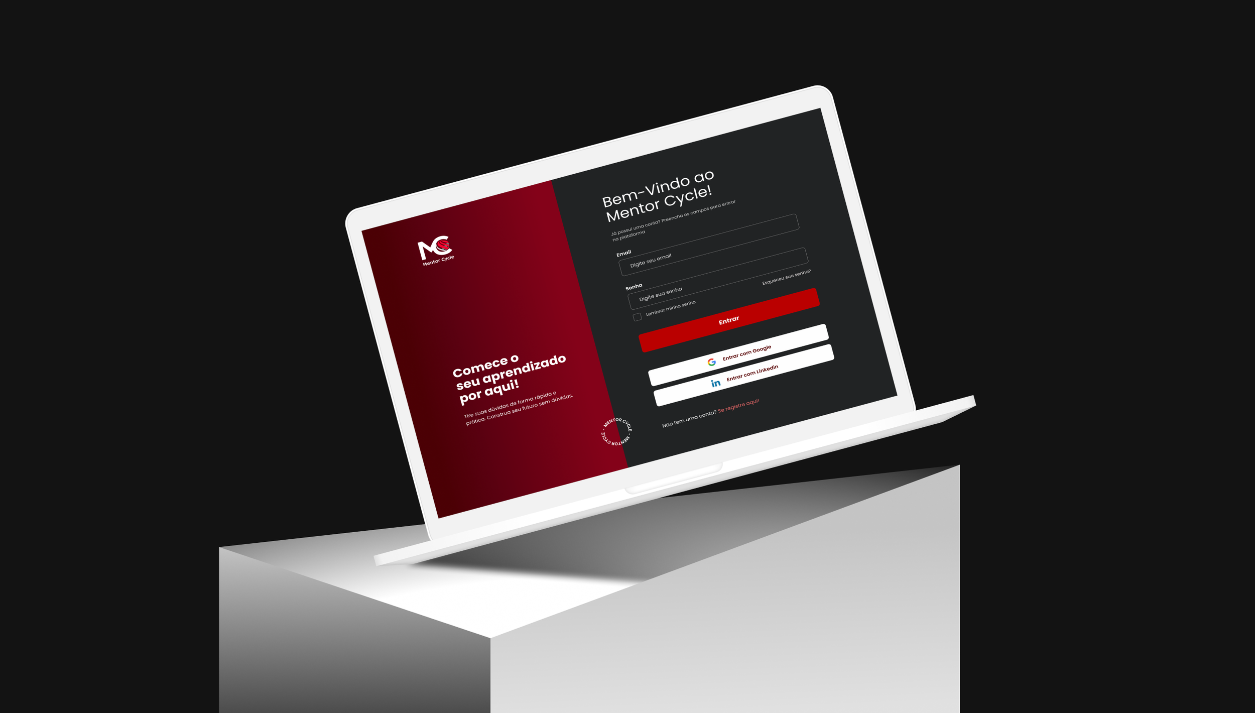
The final Landing Page of Mentor Cycle.
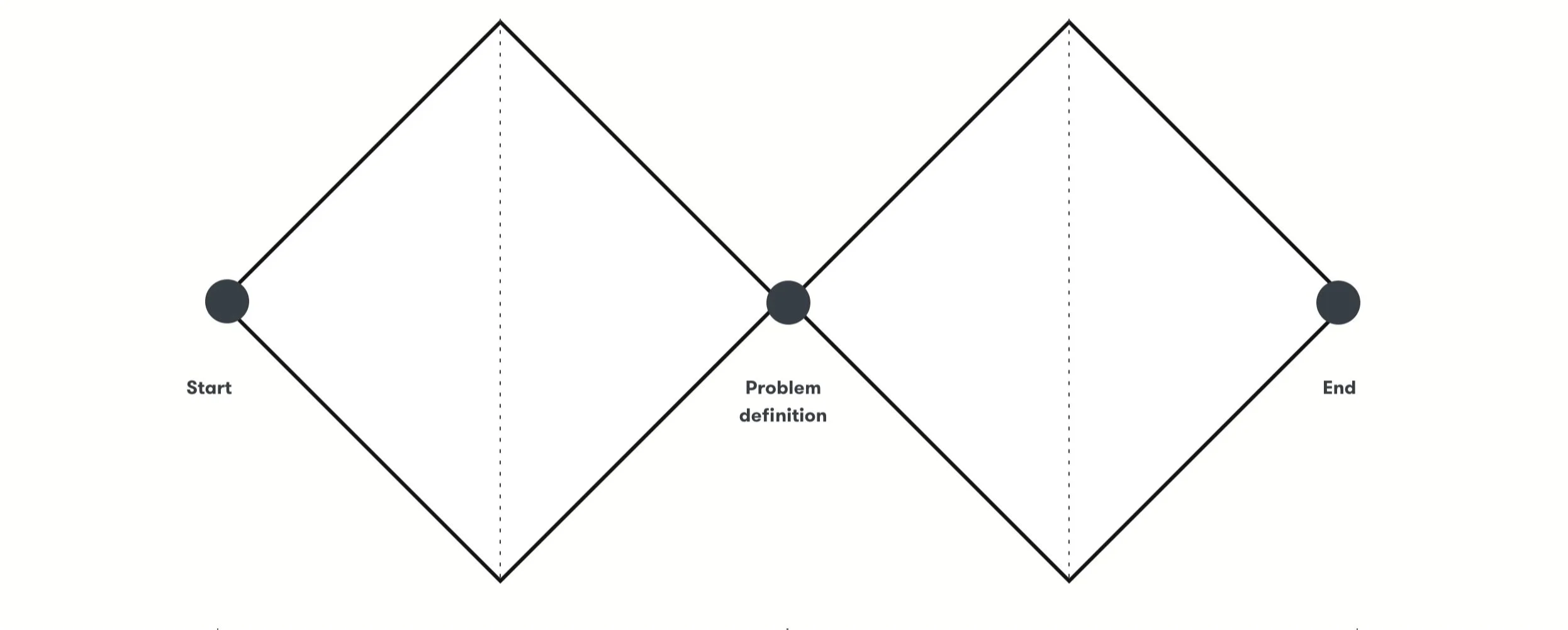
UX Strategy and ProcessStep 1 - Product DiscoveryBefore producing content for the landing page, we conducted a desk research to better understand both Mentor Cycle’s context and the mentorship market in general. I analyzed everything the team had done up until that point and mapped the current experience of both mentors and mentees. This research helped create initial personas and supported our strategic content and design decisions later on.
Desk Research

Benchmark
To guide the content and design of the landing page, we analyzed mentorship platforms such as ADPList, Awari, Talkstars, and others.
The goal was to understand how leading platforms structure their flows and present key information to attract mentors and mentees.
We focused on 3 pillars:
User flow and Feature mapping
Profile structure and Role switching
Positioning and Communication

Step 2 - Definition"How might we turn the Mentor Cycle landing page into a conversion point for mentees, while also attracting new mentors, with a consistent, accessible, and purpose-driven tone of voice?”
Step 3 - Ideation Mapping the landing page content
Based on the research, personas, and benchmarking, we defined what information should be included on the landing page. The key content areas were:
Introduction to mentors
How the platform works
How to become a mentor
FAQ with clear information
Calls to action to sign up (as mentor or mentee)

Content Strategy
Mentor Cycle didn’t have a tone of voice guide when I joined the team. I was responsible for defining the platform’s tone based on the audience and purpose, ensuring all the content followed this voice, motivational, direct, and inclusive.
I wrote the entire landing page, including:
Titles and subtitles
Explanatory sections for both audiences
Buttons and CTAs
FAQ answers with accessible language
Microcopy for interaction and navigation

Step 4 - DeliveryDelivered Mentor Cycle’s first landing page, establishing the platform’s voice and guiding users toward meaningful actions. The content was designed to be clear, welcoming, and supportive, reflecting the platform’s mission and values while addressing both mentees and mentors.
Key outcomes included:
End-to-end content creation, including titles, subtitles, explanatory sections, CTAs, FAQ answers, and microcopy for navigation.
Defined and applied a consistent tone of voice, ensuring messaging was motivational, inclusive, and aligned with user needs.
Structured content strategy that guided users through key touchpoints, from understanding the platform to signing up as a mentee or mentor.
Enhanced conversion and engagement, transforming the landing page into a key entry point for users while building trust and credibility for the platform.
The result was a cohesive, user-centered experience that combined brand storytelling, accessibility, and action-driven copy, laying the foundation for Mentor Cycle’s digital presence.
Team
Design
Thiago Castro: Product Design Lead
Flavia Foiato: Product Writer
Nara Oliveira: UX Researcher
Antônio Conceição: UX Designer
Stakeholders
Bianca Karoline: Co-founder
Leonardo Balsalobre: Co-founder