Carely
Designing a healthcare appointment experience from the ground up
Prototyping · Design system · UX/UI · Content Design
↓
Role
Product Designer
Scope
Research, interaction design and UI
Project overview
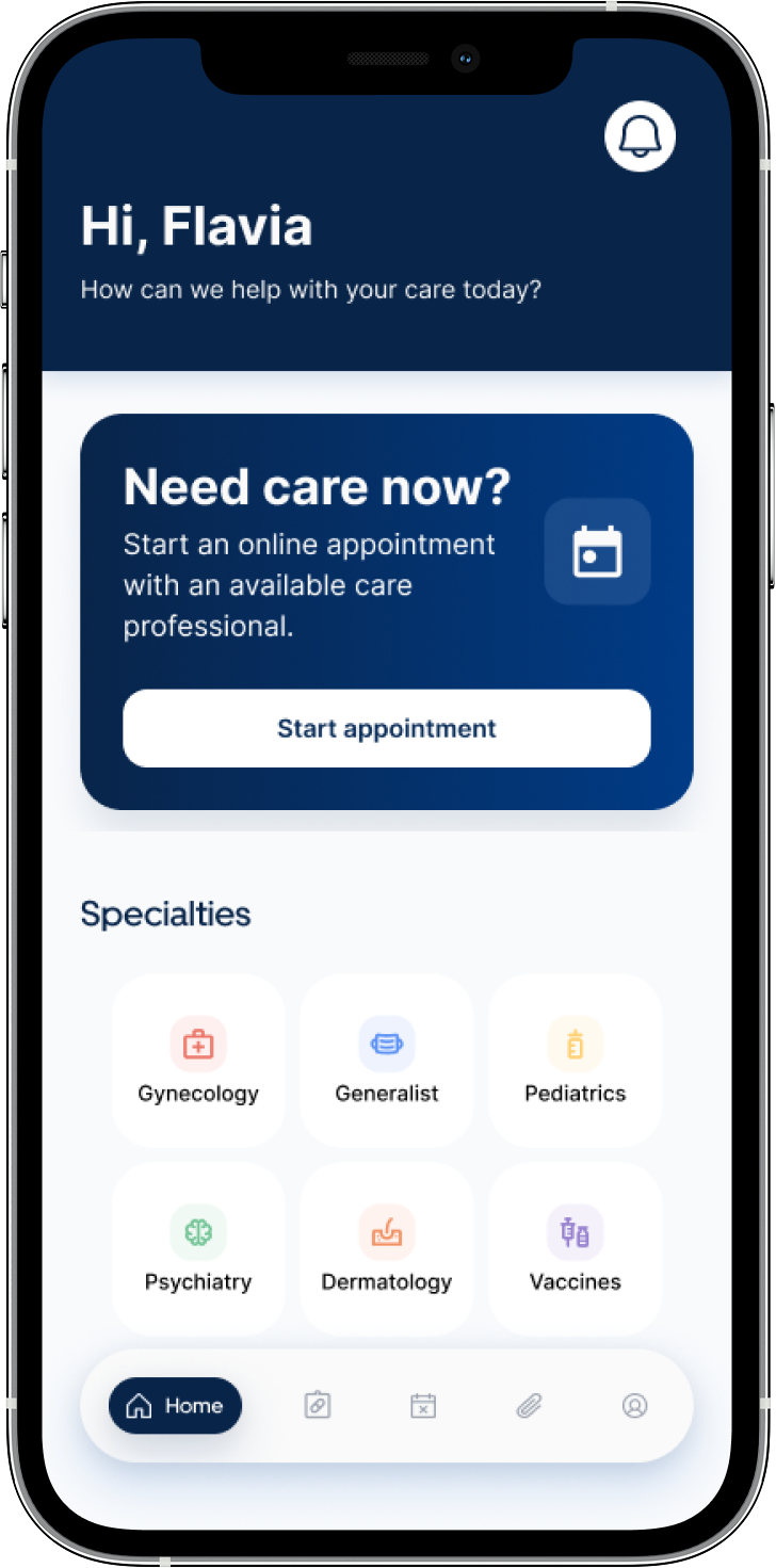
Carely is a healthcare appointment app I designed from the ground up, covering the full journey from finding a healthcare professional and booking an appointment to managing, cancelling, and rescheduling care.
While designing the broader product experience, I chose to focus on cancellation as a critical moment in the patient journey. When a healthcare professional cancels an appointment, users need to understand what happened, find another available option, and know what happens to payment, insurance, or refunds.
This became the journey I explored in greater depth: how could Carely help patients recover from a cancellation and continue their care without having to start the process over?
Timeline
12 months
What I designed
Carely connects three key moments in the appointment journey: finding care, managing upcoming appointments, and continuing care when an appointment is cancelled.
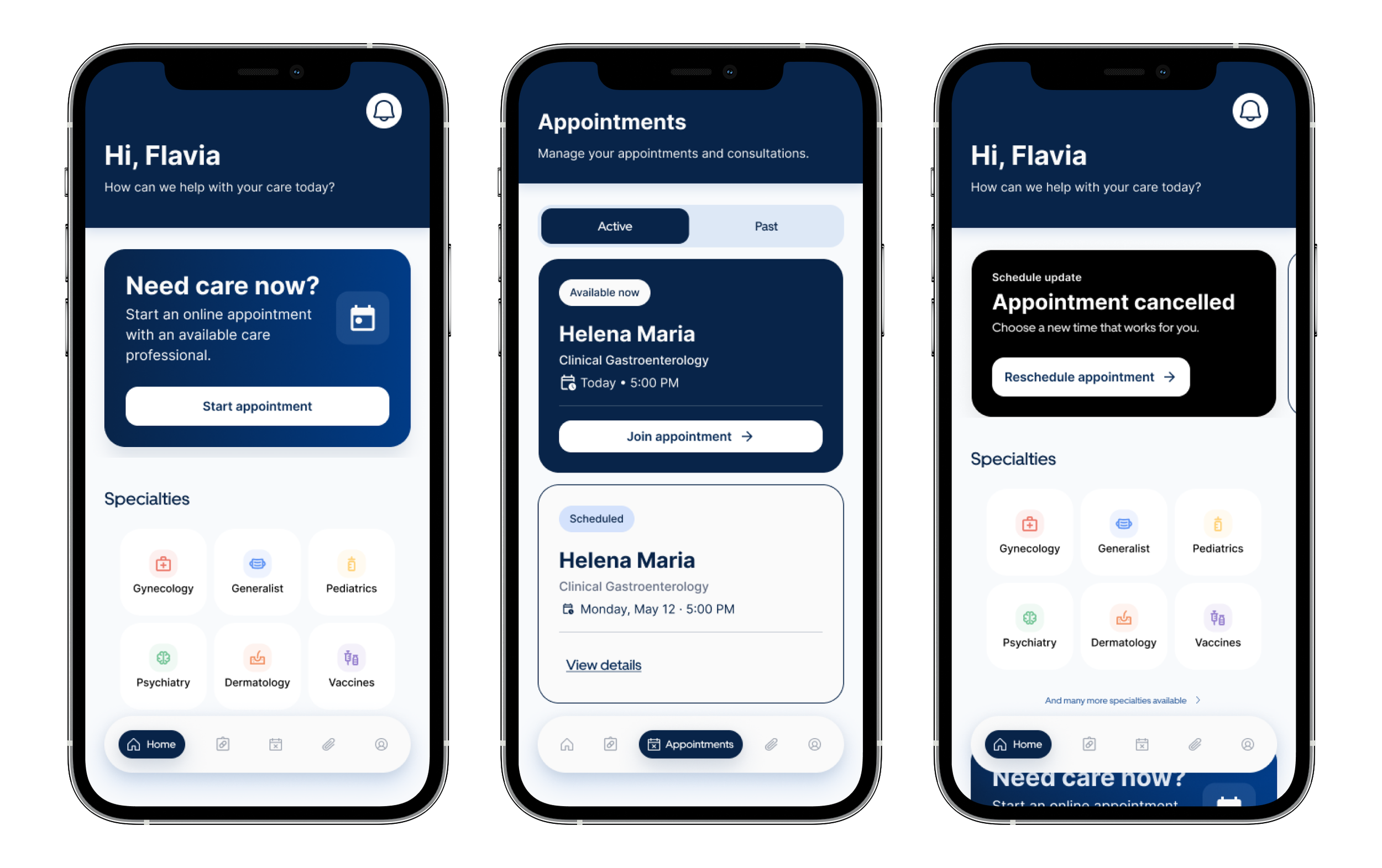
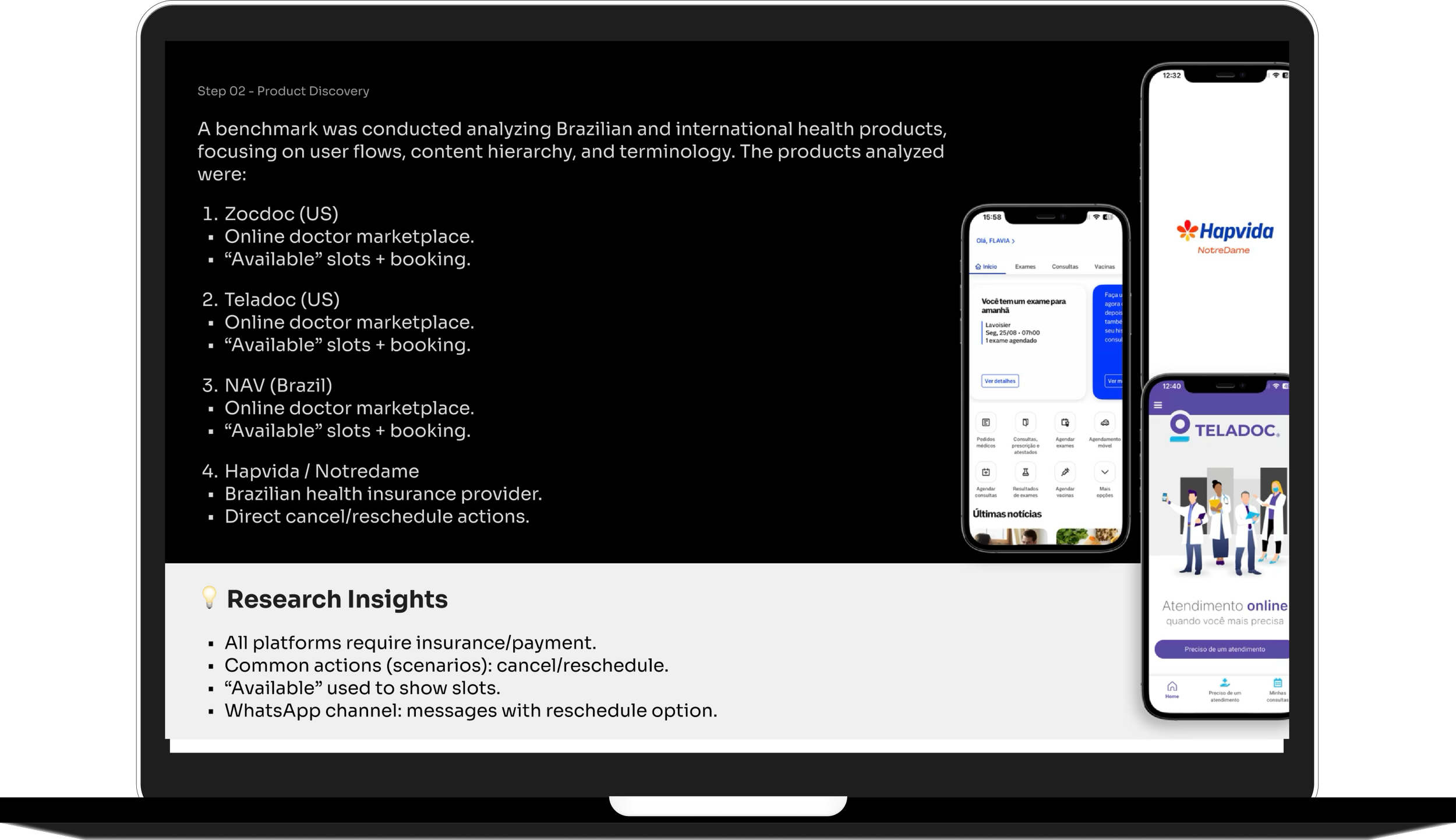
Step 1 - Product DiscoveryTo better understand the healthcare appointment experience, I conducted a benchmark analysis of Brazilian and international health products, focusing on user flows, content hierarchy and terminology.
The products analyzed included Zocdoc, Teladoc, NAV and Hapvida/NotreDame.
I looked closely at how each product structures appointment booking, professional availability, payment or insurance selection, appointment history, cancellation and rescheduling actions.
The benchmark helped me identify recurring patterns:
Healthcare apps rely on clear available slots to help users make fast decisions.
Payment or insurance information is usually part of the appointment flow.
Cancellation and rescheduling need to be visible, direct and easy to understand.
WhatsApp, email and app notifications can support important appointment updates.
Consistent terminology helps users understand the difference between booking, rescheduling and cancelling.
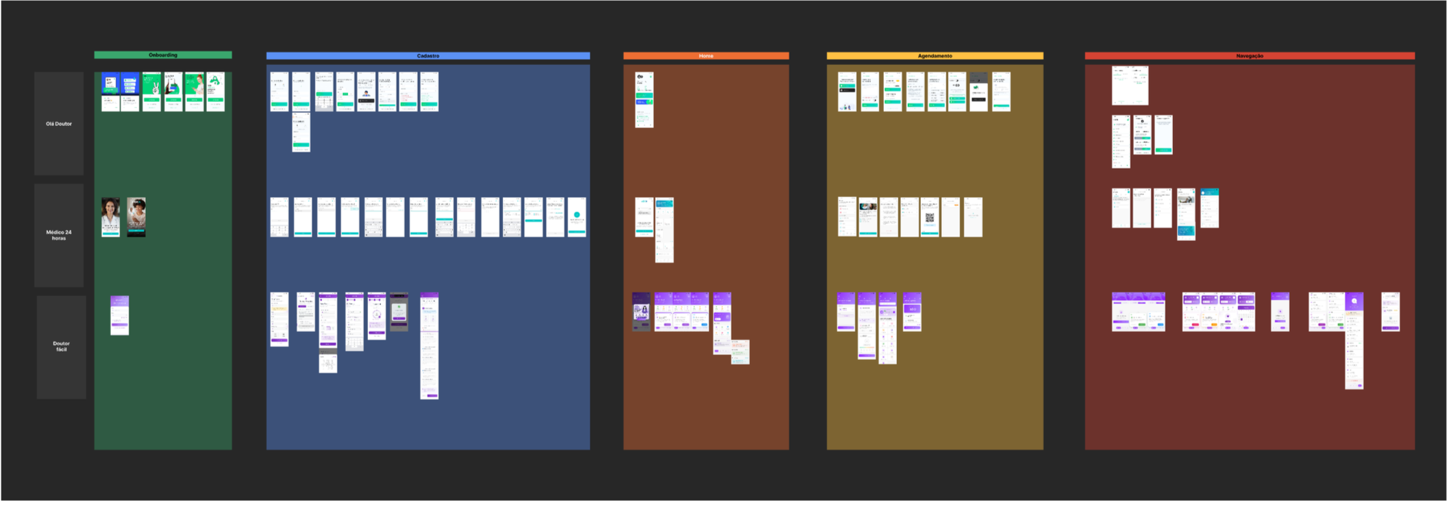
I also mapped initial product questions and assumptions:
Do patients get notified immediately when their professional cancels?
Do all patients allow app notifications or WhatsApp messages?
When do patients pay: before or after the appointment?
How are refunds or insurance claims processed?
Which professionals are included: doctors, nutritionists, therapists or other specialists?
Should the app prioritize rescheduling instead of cancellation?
How can the experience communicate urgency without increasing anxiety?
These questions helped define the main opportunity for Carely: creating an experience that combines the clarity and speed of a consultation app with the trust, organization and continuity expected from a healthcare platform.
Step 2 - Definition“How might we make it easier for patients to check their available actions when a professional cancels, while clearly communicating their rescheduling options?”
Step 3 - Ideation I designed the journey around one main principle: after a cancellation, the product should guide the patient toward care continuity.
Instead of treating cancellation as the end of the journey, I prioritized rescheduling as the main path. This decision supports both user needs and business goals, helping patients stay engaged with the platform instead of abandoning the experience.
I mapped two connected journeys:
Primary journey: reschedule appointment
The patient receives a cancellation notification, understands what happened and is guided to reschedule with the regular professional or choose another available professional.
Secondary journey: book a new appointment
The patient can start a new appointment from the home screen, using the same structure and interaction patterns created for the rescheduling flow.
To reduce friction, I reused the same layouts and components across both flows. This helped avoid duplicated journeys and made the experience more predictable.


User Journey Map
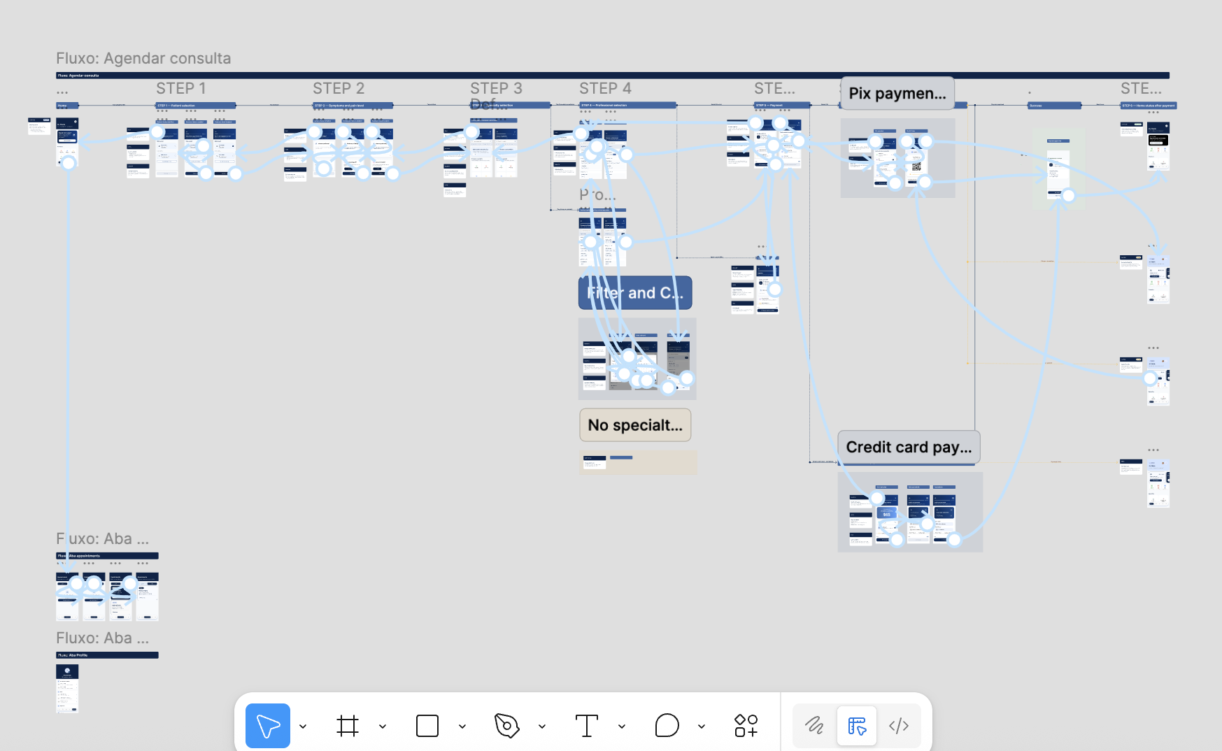
Step 4 - DeliveryThe final delivery included journey maps, wireframes, UX writing, reusable components, high-fidelity screens and a clickable prototype.
The solution included two main flows:
Appointment booking journey
Appointment cancellation and rescheduling journey
The appointment booking journey guides patients from the home screen to patient selection, symptoms, specialty, professional selection, payment and confirmation.
The cancellation and rescheduling journey helps patients understand the cancellation, check available options and continue their care journey without restarting from scratch.
The prototype was designed to balance usability, trust and emotional support. The interface uses clear navigation, structured content, consistent components and empathetic messages to guide patients in moments of uncertainty.
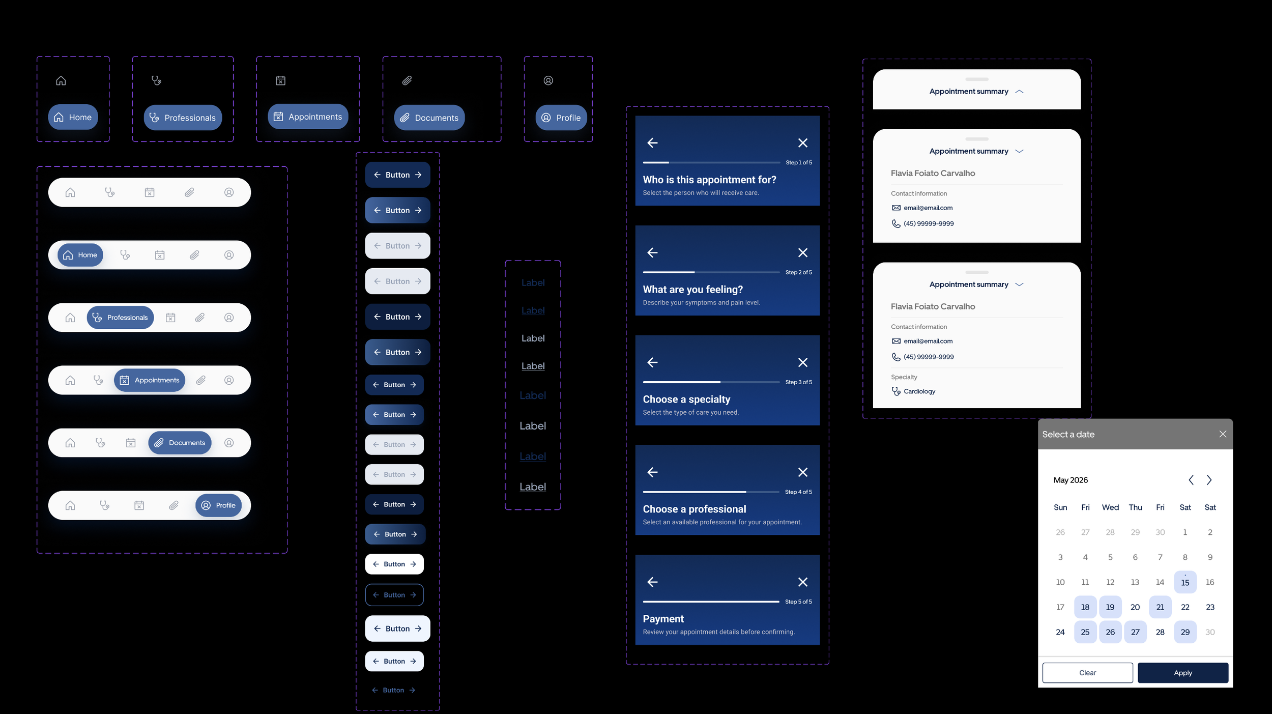
Components and UI foundationsThe final solution created a clearer recovery path after appointment cancellations and introduced a more scalable structure for the product experience.
The main design outcomes were:
A clearer cancellation and rescheduling journey
Reduced friction by reusing booking patterns across flows
More consistent terminology across the experience
Reusable components for buttons, navigation, cards, forms and appointment states
A more guided and supportive experience for moments of uncertainty
A scalable foundation for future appointment, payment and care management features
Although this concept was not measured in production, the experience was designed to influence product metrics such as:
Rescheduling rate after cancellation
Drop-off after cancellation notification
Time to complete rescheduling
Support requests about refunds or next steps
User confidence after a cancelled appointment
Design outcomes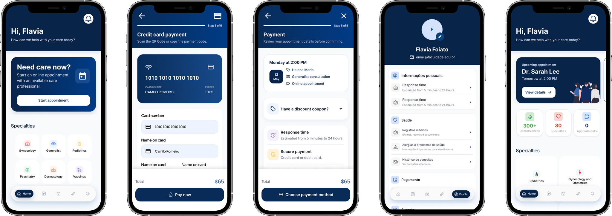
To support consistency across the product, I created a small UI kit with reusable components, visual patterns and interaction states.
The system included:
Button variants for size, hierarchy, state and icon placement
Bottom navigation with active and inactive states
Step headers for the appointment flow
Appointment summary cards
Date picker patterns
Form fields and selection states
Payment cards
Empty states
Appointment status patterns
Confirmation components
Visual direction
These components helped make the prototype more scalable and consistent across different moments of the journey.
The visual direction uses blue as the primary color to communicate trust, clarity and reliability — important attributes for a healthcare experience.
Lighter blue surfaces support guidance and task progression, while dark navy is used for high-contrast actions. Green is reserved for positive confirmation moments, such as scheduled appointments. Red is used only for critical states, such as cancelled appointments, helping users quickly identify situations that need attention.