COLGATE
EVERYDAY
Project duration
April, 2024 - May, 2024
Problem statement
The Colgate Everyday program in Turkey struggles to sustain user engagement and perceived value, given the natural consumption limits of oral care products.
Despite offering financial incentives, users often experience confusion when understanding benefits, rewards, and subscription options, impacting both satisfaction and the program’s financial sustainability.
The experience is also phygital: while interactions start digitally, key moments — such as product purchases, dental services, and brand experiences — happen offline. Without clear and empathetic content connecting these touchpoints, Colgate risks reduced loyalty, missed opportunities for engagement, and a weaker perception as a caring, innovative brand.
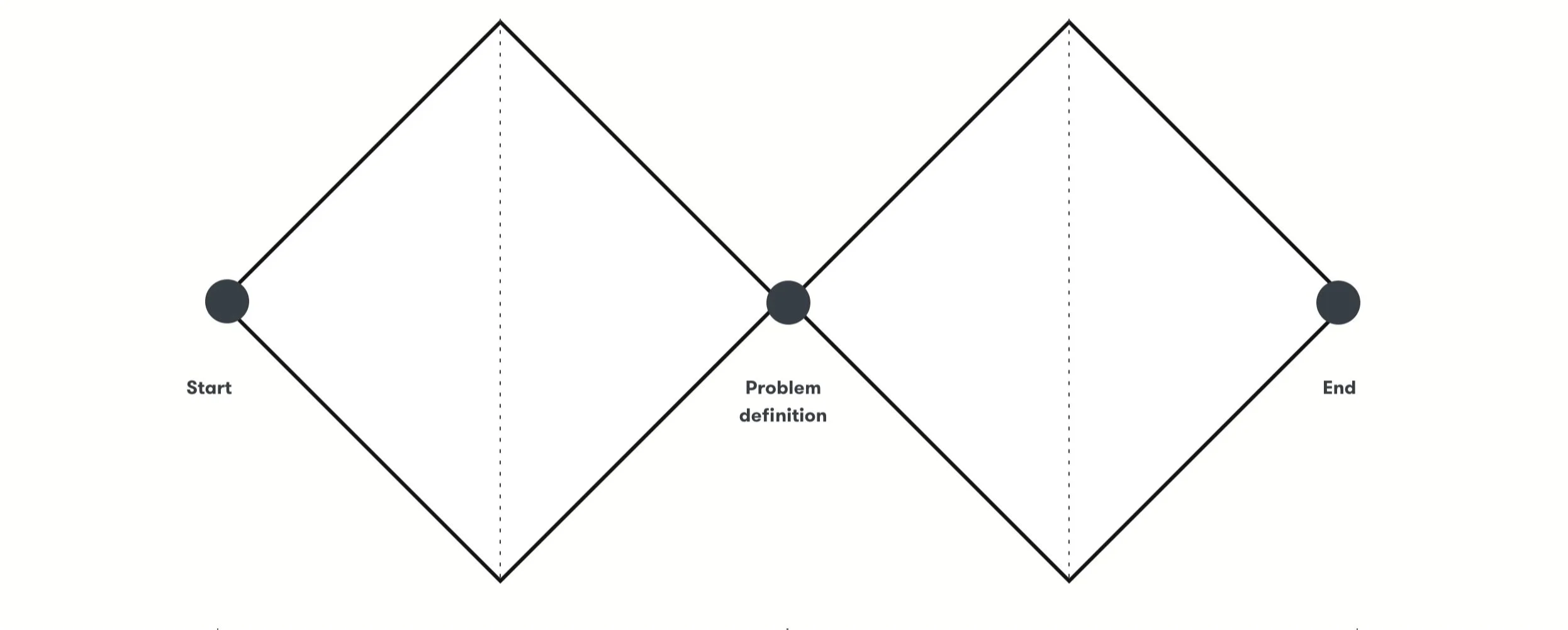
My role and proccessAs a Content Designer, I collaborated with Product Designers and Art Directors to apply and adapt the Double Diamond framework, guiding the project from discovery to delivery and aligning business goals with real user needs.
Discovery
Researched best practices and competitor platforms
Analyzed navigation and information architecture
Mapped user journeys to identify key touchpoints and pain points
Define
Developed data-driven content strategy
Established consistent brand voice and tone focused on clarity and empathy
Ideation
Designed user flows and decision trees for gamified experience
Created content and microcopy to motivate and guide user actions
Delivery
Delivered a personalized, gamified interface
Focused on seamless, intuitive user experience driven by content
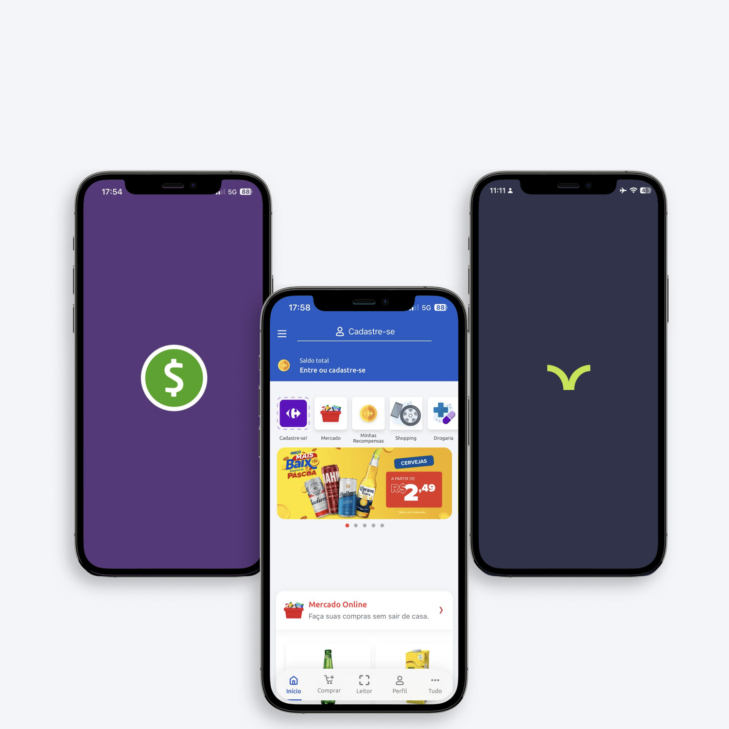
Step 1 - Product DiscoveryTo identify leading approaches and fresh ideas in Affordability programs, we examined 4 key competitors. Beyond just their features and flows, I focused on the writing — analyzing how their content enhances clarity, guides users, and drives engagement throughout the experience.
Meu Carrefour
Analyzed instructional microcopy and component texts to ensure clarity and ease of use
Reviewed tone and phrasing to reduce user friction in interactions
Méliuz
Evaluated notification messages for coupon activation to ensure clear, timely communication
Assessed tone consistency to build trust and avoid user confusion
Cuponomia
Studied label naming, button texts, and feedback messages to optimize comprehension and encourage actions
Checked error and success messages for clear, supportive communication
Vitat
Reviewed microcopy throughout the mobile activation journey to ensure concise and motivating calls to action
Analyzed text hierarchy and formatting to improve readability and ease of scanning
Benchmark
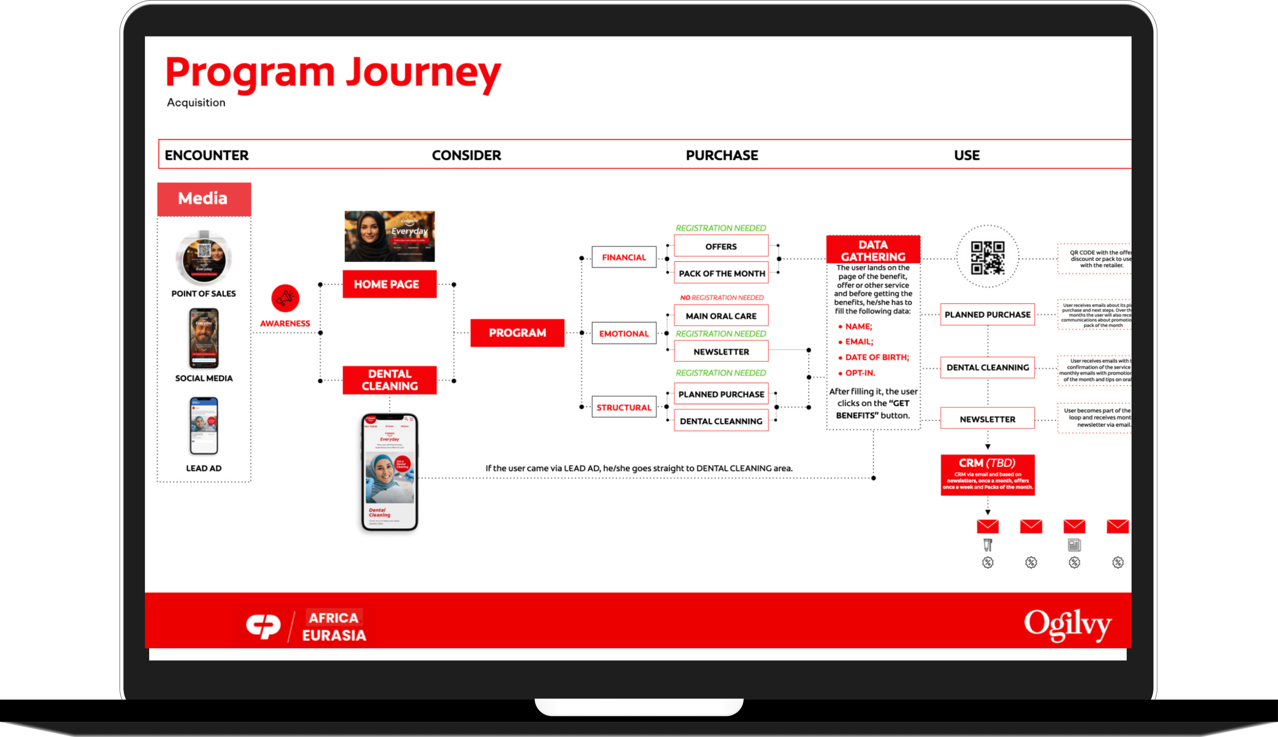
During discovery, we identified that the experience could not be designed as purely digital. Many rewards and benefits were redeemed or experienced offline, making the journey inherently phygital.
This insight influenced content decisions across the flow — from expectation-setting microcopy to instructional messages — ensuring users could seamlessly transition between digital touchpoints and physical moments without confusion or frustration.
Phygital Journey
Step 2 - Definition“How might we craft empathetic and clear content that supports Turkish consumers’ daily challenges, strengthens their loyalty to Colgate, and encourages continued engagement with the Affordability program?”

Step 3 - Ideation User journey and wireframes
In the ideation stage, we mapped out the user journey to identify key moments where clear, motivating content could guide users effectively.
We developed wireframes that integrated strategic microcopy and messaging to enhance understanding, reduce friction, and encourage desired actions throughout the interface.
This approach ensured the writing was an integral part of the design, helping the team spot content opportunities that improve the overall user experience.

Content Writing
Defining the voice and tone without a Style Guide
One of the main challenges in crafting content for the Colgate Everyday Affordability program was the absence of a formal voice and tone guide. While the brand had clear visual identities, there were no specific guidelines on how to communicate consistently within a gamified, transactional platform aimed at Turkish consumers.
To tackle this, I reviewed Colgate’s existing communication, digital, packaging, and promotional materials, to identify core language patterns and brand personality traits. The goal was to capture a tone that is friendly, trustworthy, and motivating, balancing financial benefits with the brand’s caring and innovative spirit.
I adapted this voice to create approachable, clear, and engaging copy that guides users through the gamified interface. This included microcopy for buttons, notifications, and educational messages that encourage ongoing participation without overwhelming the user.
This evolving content strategy shaped every touchpoint, ensuring coherence and empathy throughout the user journey, even without formal tone documentation.
Step 4 - Delivery Delivered a gamified, content-driven interface for the Colgate Everyday program, designed to increase user engagement and loyalty among Turkish consumers. The content strategy focused on clear, motivating, and empathetic copy, tailored to guide users through offers, rewards, and educational messages without overwhelming them.
Key outcomes included:
Strategic microcopy for buttons, notifications, and educational tips that encouraged participation and reduced friction.
Personalized content flows that balanced financial incentives with usage limits, supporting ongoing engagement.
Consistent tone adaptation despite the absence of a formal voice and tone guide, ensuring clarity, trust, and brand alignment.
Data collection touchpoints through sign-ups and interactions, enabling future personalization and optimization of offers.
The result was a seamless, engaging experience that strengthened Colgate’s brand perception as a caring, innovative leader while driving loyalty and sustained participation in the Everyday program.
Step 5 - Content Decisions by Screen 
Subheadline — “Planned Purchase”
Decision: Use Planned Purchase to describe a subscription-based commitment instead of a one-time order.
Why: The word Purchase conveys intentionality and control, emphasizing that the user is planning ahead rather than being forced into a recurring commitment.
Metrics: Terminology effectiveness was evaluated through CTR on the subscription entry point and flow progression, indicating improved understanding of the subscription model.
Supporting text — “Subscribe to the six-month package and guarantee lower prices and free shipping.”
Decision: Combine the financial incentive (lower prices) with a practical benefit (free shipping) in a concise, readable sentence.
Why: Users immediately understand the value and scope of the subscription, including duration (“six-month package”) and benefits.
Metrics: ETR was kept under 8 seconds, supporting quick comprehension. Clarity was validated through reduced hesitation before the CTA and higher progression to the next step.
CTA — “Join Subscription”
Decision: Use an action-oriented verb (Join) rather than “Subscribe” to make the action feel inclusive and empowering.
Metrics: CTA wording was validated through A/B testing and CTR comparison, confirming better alignment with user intent.

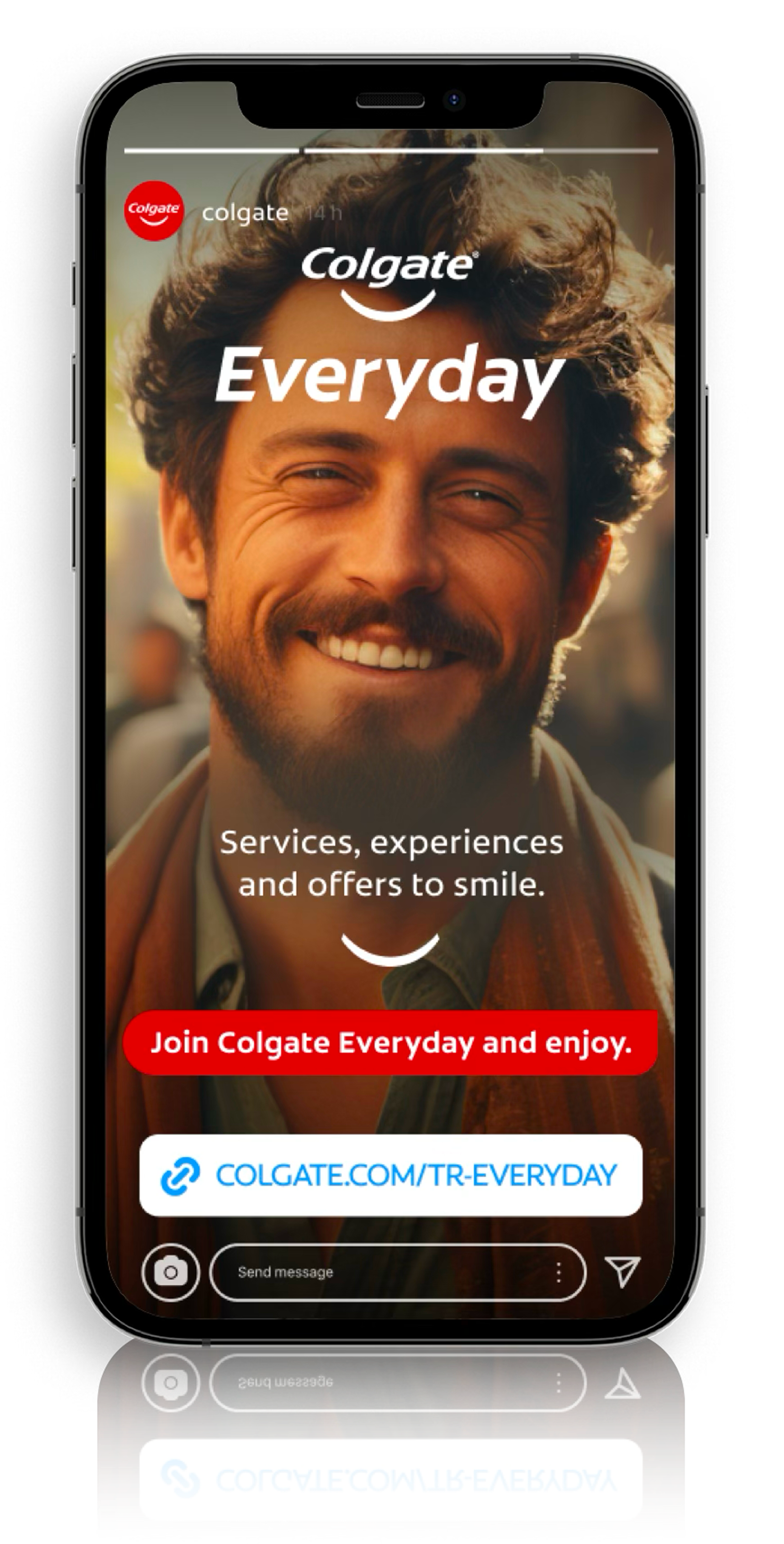
Choosing the program name — “Colgate Everyday”
Decision: We decided to name the program Colgate Everyday instead of Affordability to create a stronger emotional connection with users.
Why: “Affordability” focused mainly on price and savings, while Everyday highlights continuity, care, and presence in users’ daily lives — values deeply aligned with Colgate’s brand purpose.
Metrics: Name effectiveness was evaluated through entry CTR and time to first interaction, indicating stronger initial engagement compared to more price-focused naming.
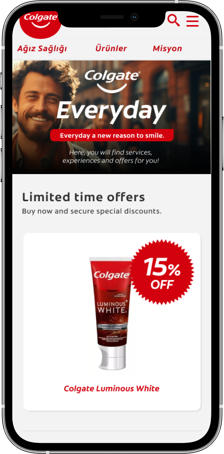
Subtitle — “Everyday a new reason to smile.”
Decision: Craft an uplifting, brand-aligned line that plays on the “Everyday” concept and Colgate’s signature symbol: the smile.
Why: This phrase ties the program’s frequency (everyday benefits) with the emotional territory of the brand (smiling, caring, confidence).
Metrics: ETR was kept under 4 seconds, supporting immediate comprehension. Engagement was validated through scroll continuation and progression into program content.
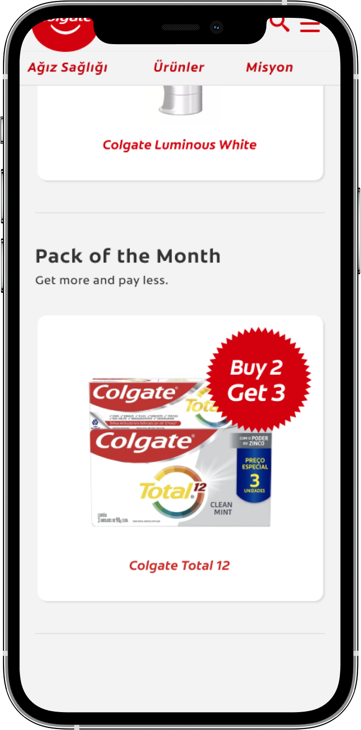
Supporting text — “Here, you will find services, experiences and offers for you!”
Decision: Use clear, inclusive language to explain what users will find in the program — not only discounts but also services and experiences.
Why: We wanted to set expectations early and show that Colgate Everyday goes beyond simple promotions. It offers valuable opportunities such as dental cleaning services, product discounts, and exclusive experiences.
Metrics: Content clarity was assessed through reduced bounce rate at the program entry and higher interaction with non-promotional items, indicating broader perceived value.

Section Title — “Main Oral Care Tips”
Decision: Use a straightforward, educational headline to introduce preventive oral care habits.
Rationale: “Main” highlights relevance and simplicity — the focus is on what really matters for daily care.
Metrics: Headline clarity was validated through CTR on the section entry and scroll behavior, confirming that users identified the section as relevant without requiring explanatory text.
Body Text — “Did you know it’s important to:”
Decision: Open with a conversational question to make the tone friendly and informative.
Rationale: This phrasing encourages curiosity and engagement, making the content feel less like an instruction and more like guidance.
Metrics: ETR (Estimated Time to Read) was kept under 5 seconds, supporting quick scanning. Engagement was monitored through dwell time and progression to the list of tips.
CTA — “Learn more”
Decision: Keep the call to action short and neutral to invite exploration.
Rationale: Users who are interested in improving oral health can easily continue learning without feeling pressured.
Metrics: CTA effectiveness was evaluated using CTR, validating that interested users continued learning without friction.
Team
Design
Sabrina Escorcio - Product Design
Flavia Foiato - Content Design
Luzia Faria - Copywriter
Caio Saavedra - Art Director
Stakeholders
Rubens Casanova - Creative Director
Alessandra Dal Bianco, Managing Director
André Richter, Project Manager
Ana Paula Ribeiro - Digital Consumer Experience Colgate