meridol
Designing a personalized gum health content experience
Creating the content strategy, outcome logic and personalized guidance for a digital experience across Saudi Arabia and South Africa.
↓
Client
Colgate-Palmolive
Project overview
Brand
meridol
meridol wanted to create a digital experience that could help people better understand their gum health while strengthening the brand’s position as a trusted source of oral-care expertise.
The challenge went beyond writing a health quiz. The experience needed to turn a small set of user inputs into useful, personalized guidance — while remaining approachable, culturally relevant and trustworthy across Saudi Arabia and South Africa.
My focus was designing the content system behind the experience: how questions captured meaningful signals, how those signals shaped outcomes, and how context changed what users saw next.
Markets
Saudi Arabia & South Africa
Role
Content Designer
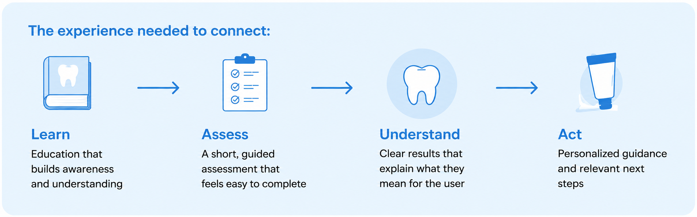
From brand purpose to a connected gum-health programFor Saudi Arabia and South Africa, the Gum Program translated meridol’s brand purpose into a connected consumer experience designed to build awareness, help people understand their gum health and guide them toward relevant action.
The assessment was one part of a broader journey connecting acquisition, first-party data, outcome signals, educational content, product recommendations and follow-up communication. These touchpoints needed to work as one system rather than as isolated experiences.
Scope
Content strategy, content architecture, outcome logic, personalization, voice & tone
Brand purpose
Empower people to care for their gums through science.
↓
Program role
Build awareness, help people understand their gum health and guide them toward action.
↓
Consumer value
Relevant education, personalized guidance and clearer next steps.
Mapping the flow showed that a small number of questions could support multiple personalized outcomes. The content structure became the logic connecting user input, outcome guidance and the final recommendation.
How the program worked as a connected system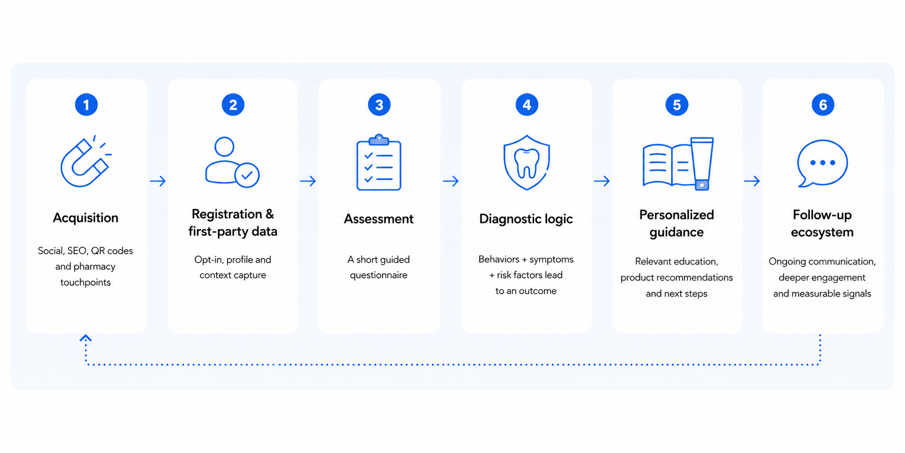
The Gum Program was designed as an end-to-end experience that turns brand purpose into real impact. Each step builds on the previous one, connecting acquisition, assessment, personalization and follow-up into a single experience.
Framing the content problemThe product needed to behave like an assessment without presenting itself as a medical diagnosis. I needed to make each question easy to answer, each outcome clear and credible without creating unnecessary alarm, and each recommendation useful enough to move the user forward.
The question sequence moved from familiar behaviors to symptoms and risk factors, using everyday language instead of clinical terminology. This made the assessment easier to understand without reducing the quality of the information collected.

Understanding how health assessments build trustI reviewed health assessments and digital wellness experiences to understand how they structured questions, introduced sensitive topics, communicated results and moved users from assessment to action.
Rather than looking only at interface patterns, I focused on the role content played in helping users understand what was being asked, why it mattered and what would happen next.
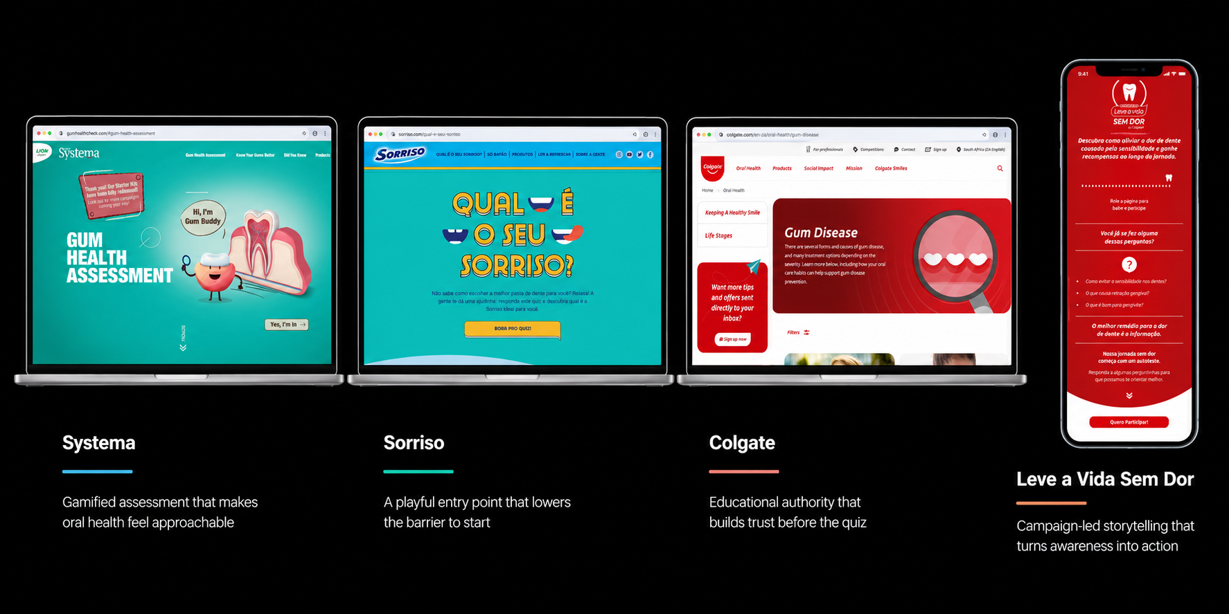
Across the references, the strongest experiences combined a low-friction entry point with progressive education. The opportunity was not to replicate a quiz pattern, but to use content to gradually move users from curiosity to understanding and then to action.
Mapping the assessment logic
I mapped how a small set of user inputs could lead to different outcomes without making the assessment feel complex.
Each question needed to capture information that could influence the result — from everyday oral-care habits and observable symptoms to risk factors — while remaining easy for users to answer.
Inputs
Behaviors → Symptoms → Risk factors
Logic
Responses → Combined signals → Outcome
Outputs
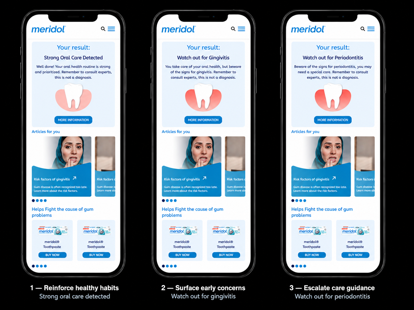
Strong Oral Care Detected
Watch out for Gingivitis
Watch out for Periodontitis
Content model
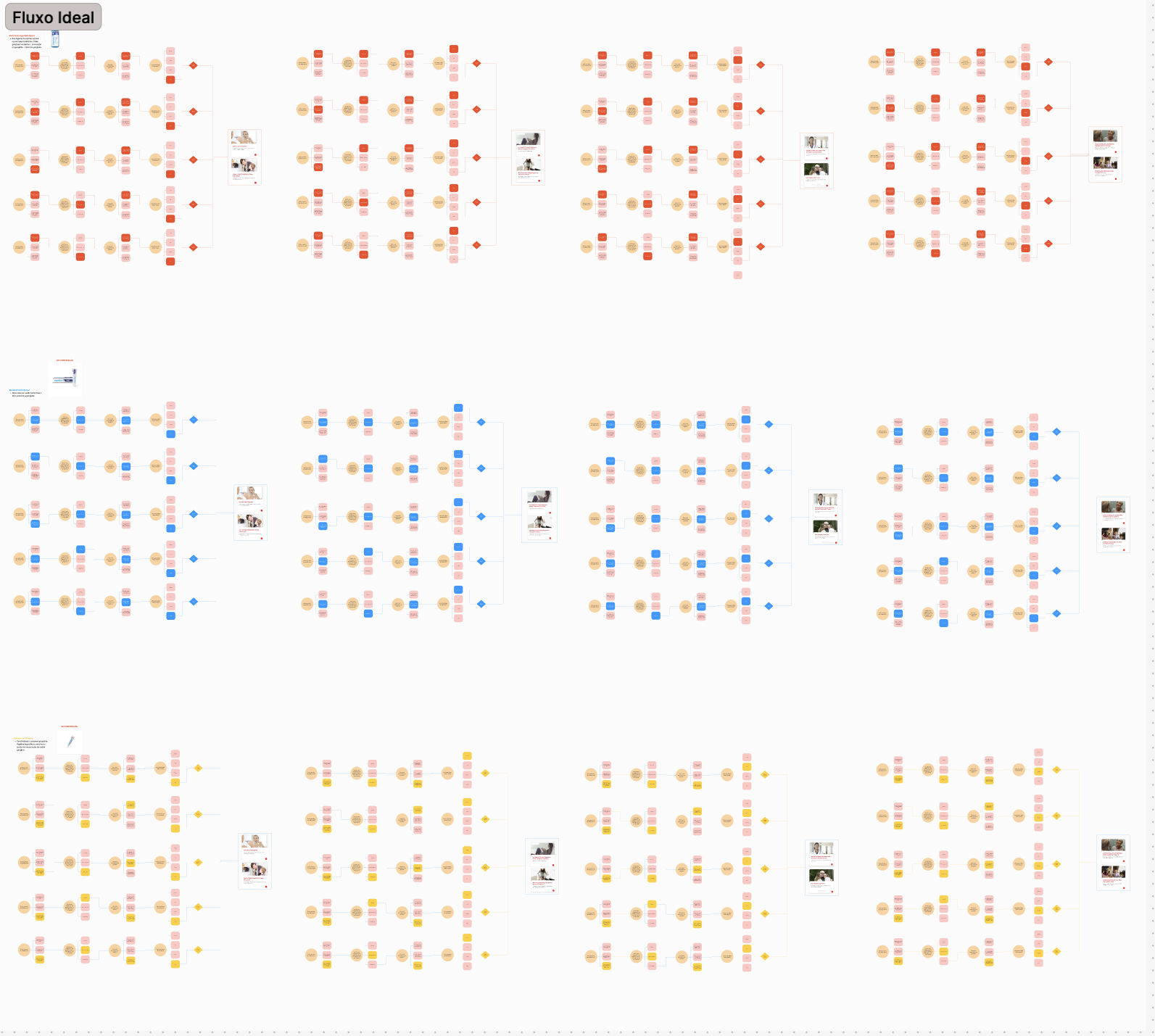
From complexity to a focused assessmentEarly references showed how quickly health assessments could become long, clinical or cognitively demanding. Rather than reproducing that complexity, I reduced the experience to the minimum set of signals needed to generate useful guidance.
This meant limiting the assessment to four questions and keeping the complexity of the underlying model out of the interface.
The goal was to collect enough meaningful information to support personalized outcomes without making the experience feel like a medical form.
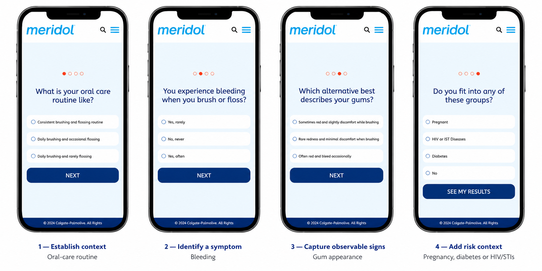
Designing the question sequenceThe order of the questions was intentional. I structured the sequence around progressive sensitivity and decision value, starting with familiar behavior before moving into symptoms, observable signs and health-related risk factors.
Each answer added a different signal to the outcome logic while gradually building context for the user. More sensitive questions appeared only after the experience had established what was being asked and why it mattered.
This allowed the assessment to gather increasingly specific information without increasing the perceived effort or making the interaction feel clinical.
Turning answers into personalized outcomesThe assessment was designed as a content system rather than a linear quiz. Each response contributed a signal to the outcome logic, and combinations of those signals determined the final outcome.
I worked with the team to define how behaviors, symptoms and risk factors should influence the result while keeping the experience understandable to users. The complexity remained in the model — not in the interface.
Designing the result experienceEach outcome needed to do more than label a condition. The result had to explain what the signals could mean, provide appropriate reassurance without presenting itself as a diagnosis, and give users a clear next step.
Personalization beyond the result
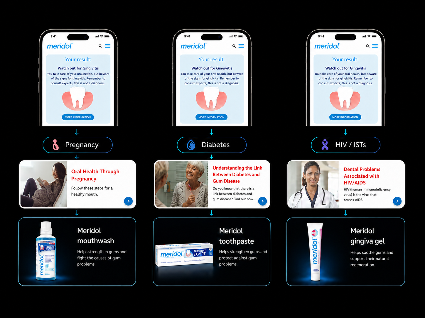
Personalization did not stop at the outcome. Risk factors captured during the assessment changed the guidance users received, allowing the same core result to lead to more relevant content and recommendations.
The outcome defined what the user needed to understand; their context defined what they needed next.
Bringing the system together
The final content system connected the assessment to outcomes, contextual signals, personalized education, product guidance and follow-up. Instead of behaving like a medical form, the experience guided users from familiar behaviors to more sensitive information, generated clear outcomes, and extended the journey with personalized education and product recommendations.
Acquisition
↓
Assessment
↓
Outcome + contextual signals
↓
Personalized education & product guidance
↓
First-party relationship / follow-up
The assessment also created a first-party data layer for the broader Gum Program. User responses could inform not only the immediate outcome, but also the educational content, product guidance and follow-up communication that came next.
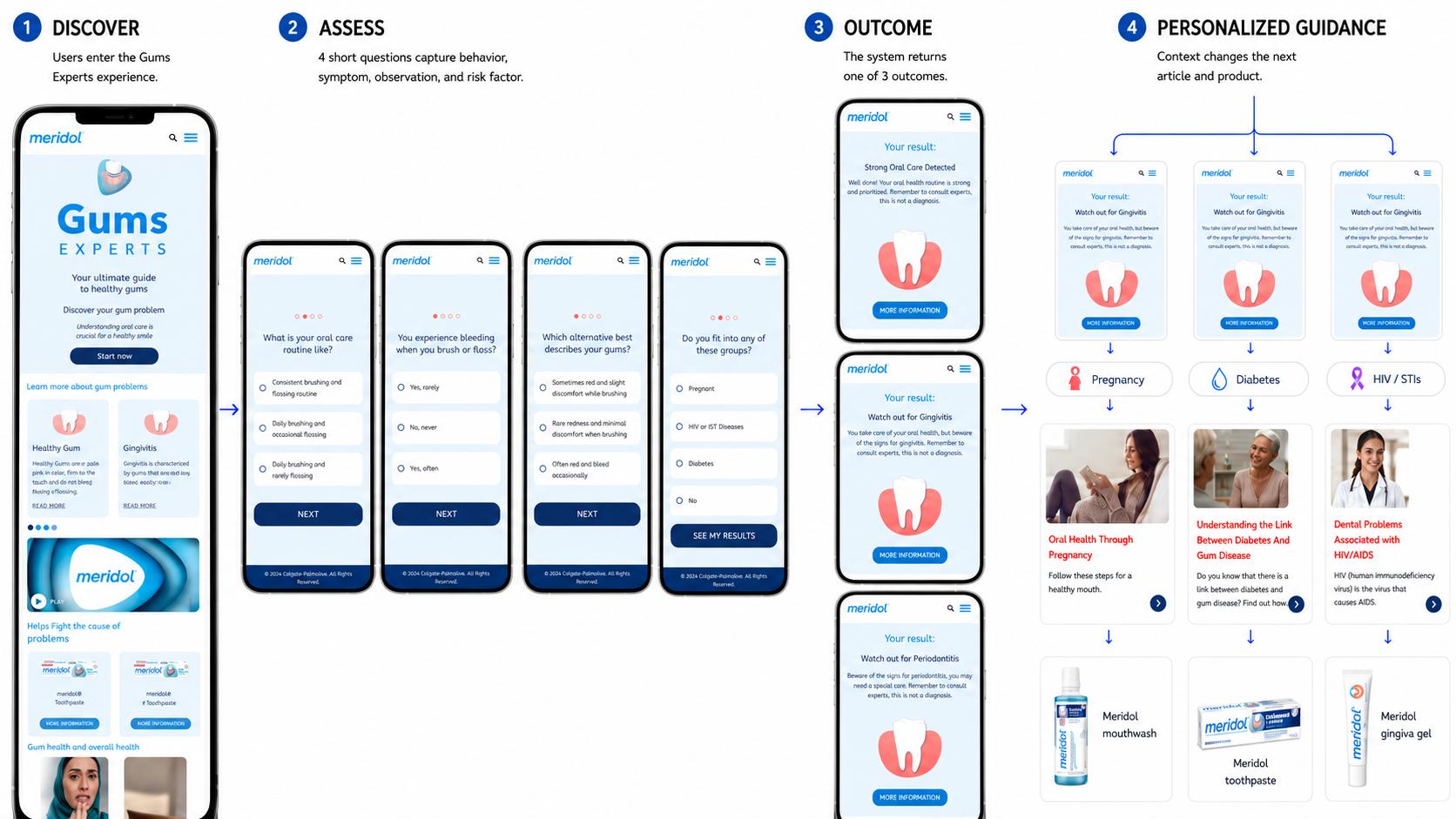
The underlying model could be complex while the user experience remained simple. Each path connected a small set of answers to an outcome, relevant content and a clear next action.
What the content system enabled
Less effort, meaningful signals
A small set of questions captured the signals needed to generate useful guidance without exposing users to the complexity behind the model.
Context changes guidance
The same outcome could lead to different educational content depending on relevant risk factors.
One connected content system
Assessment, education and product recommendations worked as one content system rather than disconnected touchpoints.
My contributionI owned the content architecture connecting questions, assessment signals, outcomes, educational content and product recommendations. I defined the question sequence, result messaging, personalization logic and voice across the experience.
The experience was not simply a health quiz, but a content system designed to move users from uncertainty to understanding and action.
What changed after launchWithin the first 6 months
1,000+
assessment completions
more than 1,000 people completed the gum-health assessment within the first six months.
#3 → #2
brand position
meridol moved from the third to the second most-used brand in the Saudi Arabia and South Africa market.
+45%
article traffic
visits to meridol’s educational articles increased by more than 45%, extending engagement beyond the assessment.
The experience did more than generate an outcome. It created a path from assessment to education and product discovery, helping meridol turn personalized content into sustained brand engagement.
Team
Design
Sabrina Escorcio - Product Design
Flavia Foiato - Content Design
Luzia Faria - Copywriter
Caio Saavedra - Art Director
Stakeholders
Rubens Casanova - Creative Director
Alessandra Dal Bianco - Managing Director
André Richter - Project Manager
Ana Paula Ribeiro - Digital Consumer Experience (Colgate)