GUMS
EXPERTS

Project duration
March 2024 - May 2024
Problem statement
In Saudi Arabia and South Africa, gum health receives little attention compared to general oral care. Despite being at higher risk, groups such as pregnant women, diabetics, and people living with HIV often lack accessible guidance or resources to identify early signs of gum disease.
meridol, aiming to position itself as a trusted expert in gum health, needed to bridge this knowledge gap through a digital experience that could educate, engage, and collect first-party data — all while maintaining cultural relevance and user trust.
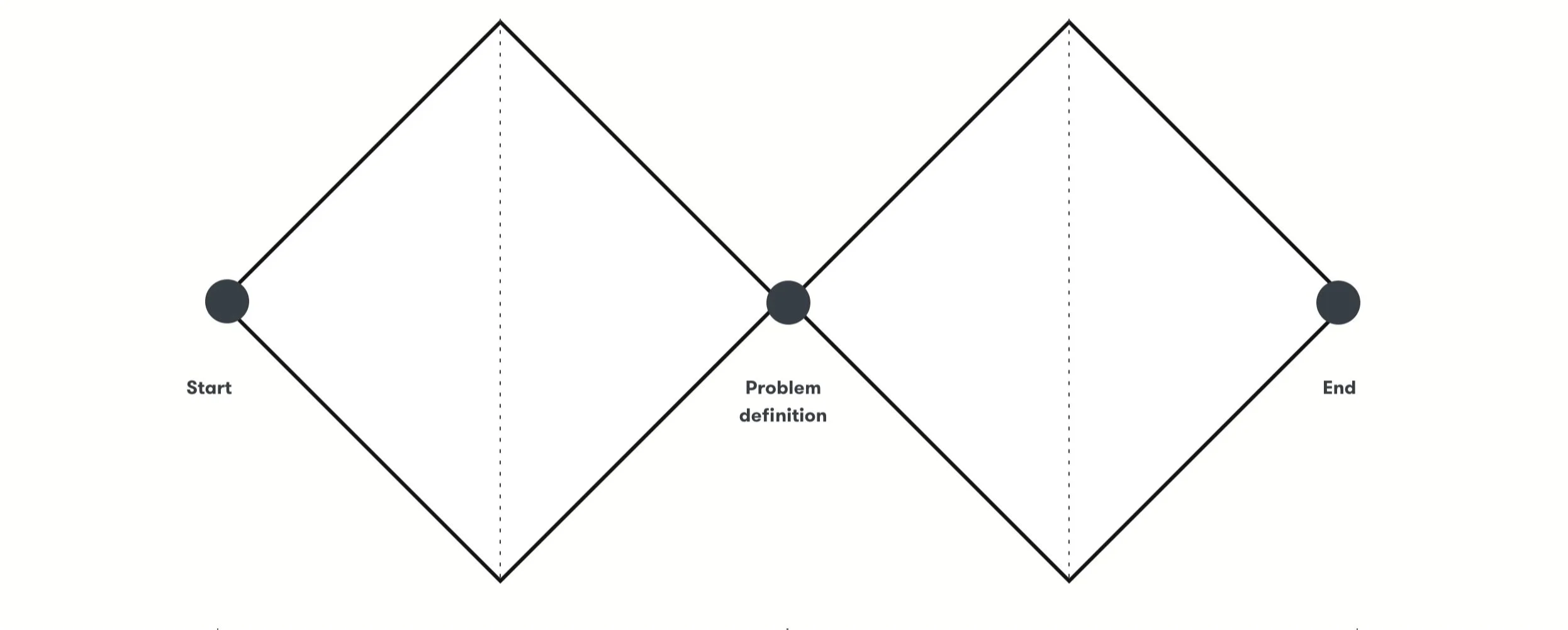
In collaboration with Product Designers, Art Directors and Marketing, we applied and adapted the Double Diamond framework to align business goals with real user needs.
My role and process
Methods
Discovery
Desk research
Competitive benchmarking
User journey analysis
Define
Data-driven content strategy
Definition of brand voice and tone for consistency and empathy
Ideation
User flow mapping and decision trees for a gamified interface
Content development tailored to outcome-focused journeys
UX writing and microcopy are crafted to drive clarity, motivation, and user action
Delivery
The final interface is gamified and driven by content personalization, designed to engage users and guide them through a seamless, intuitive experience
Step 1 - Product DiscoveryA desk research was conducted to gain a deep understanding of user behaviors, audience segments, and cultural nuances in Saudi Arabia and South Africa. These insights informed the creation of a gamified user interface, with tailored content and personalized coupons, designed to drive sign-ups, support first-party data acquisition, and educate users about gum diseases through content.
Desk Research

Benchmark
To design a high-impact quiz experience, we analyzed health and wellness apps such as Zenklub, Systema, and others.
The goal was to understand how top platforms structure quizzes and forms to engage users, collect data, and convert actions into value.
We focused on 3 pillars:
Test structure and Content flow
Placement in the user journey
Business alignment

Step 2 - Definition"How might we design a personalized digital experience that helps users identify early signs of gum issues, while driving engagement, educating high-risk groups, and supporting first-party data collection?"

Step 3 - Ideation Mapping the user journey and defining the user flow
During the ideation phase, we focused on understanding users’ behaviors, needs, and pain points. I led the definition of the quiz content and logic — from the number and type of diagnostic questions to how each response would lead to a personalized outcome.
Together with Product Designers, we mapped the end-to-end user journey to visualize how users would interact with the experience, and I collaborated with the Content Manager to align messaging and data collection goals with business priorities.
The result was a set of 40 detailed user flows, each combining responses to the four diagnostic questions with tailored guidance for specific risk groups. For instance, users who were pregnant and showed signs of gingivitis received targeted advice and product recommendations relevant to their condition.
These tools helped align the team on opportunities for improvement and innovation while ensuring that the content delivered a clear, trustworthy, and supportive experience.

Guided content flow
All content was developed with a clear focus on guiding users through personalized outcomes to the user personas, rooted in meridol’s established brand tone, visual identity, and UX patterns.
Simplicity, trustworthiness, and clarity were the guiding principles to ensure users feel supported, and not overwhelmed with not valuable information.
The content experience was designed around a diagnostic approach, delivering just three clear outcomes based on user input:
Gingivitis
Periodontitis
Good oral health


Content Design
Defining the voice and tone without a style guide
One of the key challenges in developing content for the meridol Gum Experts platform was the lack of a voice and tone guide. Although the brand provided visual guidelines, there were no definitions for how meridol should sound. Especially in a digital, interactive environment targeting users in different cultural contexts.
To address this, I conducted an in-depth review of meridol’s existing materials, including packaging, website copy, and educational content. I mapped out recurring language patterns, key terms, and communication choices to identify the brand’s implicit tone, technical but caring, informative yet reassuring.
From there, I adapted this tone to suit a more conversational and accessible experience. Since we were guiding users through a health-related quiz, the content needed to feel trustworthy and professional without being clinical. I simplified terminology, avoided jargon, and focused on empathy, clarity, and regional relevance.
This content strategy informed the entire user flow, from onboarding screens to quiz questions, error messages, and email communications, ensuring a consistent voice throughout the experience, even in the absence of formal documentation.
Step 4 - Delivery The final delivery was a gamified, content-driven interface tailored to different user personas in Saudi Arabia and South Africa. By combining clear UX writing with a conversational and empathetic tone, we guided users through an engaging diagnostic experience that:
Educated on gum health with simple, trustworthy language.
Delivered three outcomes (Good oral health, Gingivitis, Periodontitis) with personalized recommendations.
Collected first-party data through sign-ups and email follow-ups.
The result was a seamless experience that connected education, engagement, and brand positioning, while strengthening meridol’s role as a gum health expert in both markets.

Step 5 - Content Decisions by Screen Program Name — “Gums Experts”
Decision:
We chose “Gums Experts” as the program name to clearly communicate authority, trust, and educational value around gum health. The goal was to position meridol as an expert brand in a market where awareness about gum diseases is still low.
Alternative options explored included names such as:
“Healthy Gums Hub” — more community-focused, but lacked the professional and expert connotation needed for credibility.
“Gum Health Check” — descriptive and diagnostic, but too clinical and less aligned with the brand’s approachable tone.
“Smile Care Guide” — friendly, but too generic and not specific enough to gum health.
“Gums Experts” struck the right balance: professional yet accessible, positioning meridol as a trusted source of knowledge rather than just a product brand.
Why:
The name reinforces meridol’s scientific authority while remaining easy to understand in both Saudi Arabian and South African markets. It signals credibility (“experts”) and relevance (“gums”), two critical factors to engage users in a health-related quiz. By naming the program this way, we framed the experience as both educational and personalized — users are learning directly from the experts who care about their oral health.

Data page
Decision:
We designed this step to feel like a natural continuation of the quiz rather than a barrier. The phrase “Tell us about yourself and begin your gum care journey” was chosen to keep the experience friendly and purpose-driven — the user understands that sharing their data is the next step in receiving personalized guidance.
Instead of technical or transactional wording like “Fill in your details” or “Register now”, we used inclusive, motivational language that connects data sharing to the user’s own benefit.
Form fields — “Type your name / e-mail / phone”
We kept the field labels short and clear to maintain simplicity and visual balance on mobile. The use of Type your… adds an action-oriented tone while keeping it conversational, matching the rest of the experience.
Buttons — “Continue” and “Back to quiz”
Continue reinforces progress and helps users feel they’re moving forward in their journey. Back to quiz offers a sense of control, allowing users to review or adjust their answers without frustration.
Why:
This screen had two main goals — collecting first-party data and maintaining user trust. The content decisions focused on reducing friction and making data entry feel like a meaningful step in the learning journey, not an obligation. By framing the action as part of the gum care journey, the experience stays aligned with the brand’s caring and educational tone.

Quiz questions and microcopy
Decision:
We designed short, conversational questions to make the diagnostic flow approachable and intuitive. Each question focuses on everyday behavior and visible symptoms rather than medical terminology, helping users self-assess without feeling overwhelmed or judged. The progression — from oral care routine, to symptoms, to risk groups — mirrors a real diagnostic reasoning process, making the final result feel credible and personalized.
We intentionally limited the quiz to four key questions, ensuring clarity and completion while still providing accurate guidance.
Buttons — “Next” and “See my results”
We used Next and See my results to maintain a natural, conversational rhythm throughout the quiz. Instead of traditional CTAs like Continue or Submit, we chose language that feels more human and action-oriented.
Next keeps the experience light and forward-moving, reducing friction between questions. See my results adds curiosity and ownership — users feel they’re actively uncovering their personalized outcome, not just completing a form. This choice was validated through usability testing, where participants consistently preferred See my results over more generic options.
Why:
The goal of these choices was to create empathy and build trust — transforming a potentially clinical topic into a simple, guided conversation. Clear, friendly, and purposeful microcopy encourages completion, supports personalization, and strengthens the user’s confidence in the platform and in meridol as a gum health expert.


Your result — Personalized outcome screen
Decision:
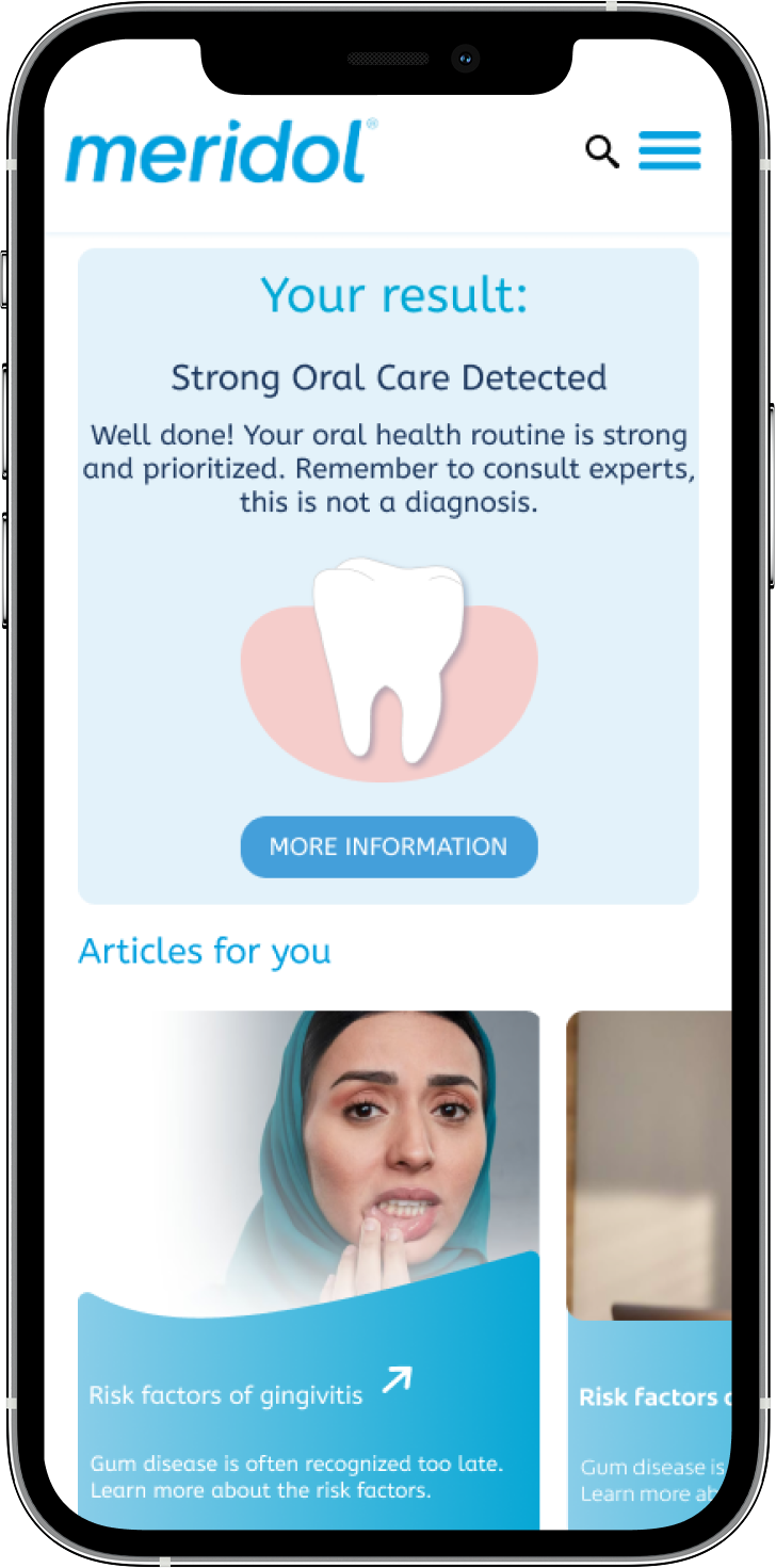
This step delivers personalized feedback based on the user’s quiz responses. Each result — Strong Oral Care Detected, Watch out for Gingivitis, and Watch out for Periodontitis — was crafted to sound educational and supportive, not clinical or alarming.
We avoided medical terms or diagnostic language to ensure compliance with health communication standards and to reinforce that the quiz offers guidance, not medical evaluation. That’s why every result includes the disclaimer “Remember to consult experts, this is not a diagnosis.”
Tone and structure:
Positive reinforcement: “Well done!” motivates users with strong habits.
Empathetic alerts: “Watch out for…” balances warning and care — it signals attention without creating fear.
Consistent CTA: “MORE INFORMATION” invites users to continue learning about gum care, keeping the flow active rather than ending abruptly.
Why:
These texts translate health insights into accessible and encouraging language. Each message is short, visually scannable, and consistent in structure, which helps users quickly understand their result and next step. The tone reflects the program’s educational mission — guiding users to awareness and prevention through gentle motivation.


Experience the Gum test at meridol
By clicking the button, you’ll be redirected to meridol’s website.
Team
Design
Sabrina Escorcio - Product Design
Flavia Foiato - Content Design
Luzia Faria - Copywriter
Caio Saavedra - Art Director
Stakeholders
Rubens Casanova - Creative Director
Alessandra Dal Bianco - Managing Director
André Richter - Project Manager
Ana Paula Ribeiro - Digital Consumer Experience (Colgate)

