Business
Dash
Clients
Bradesco Bank
Industry
Financial
Role
Senior Content Designer
Year
2024 - Today
Project Overview
Context
Bradesco, one of the largest banks in Latin America, provides services to a wide range of corporate clients.
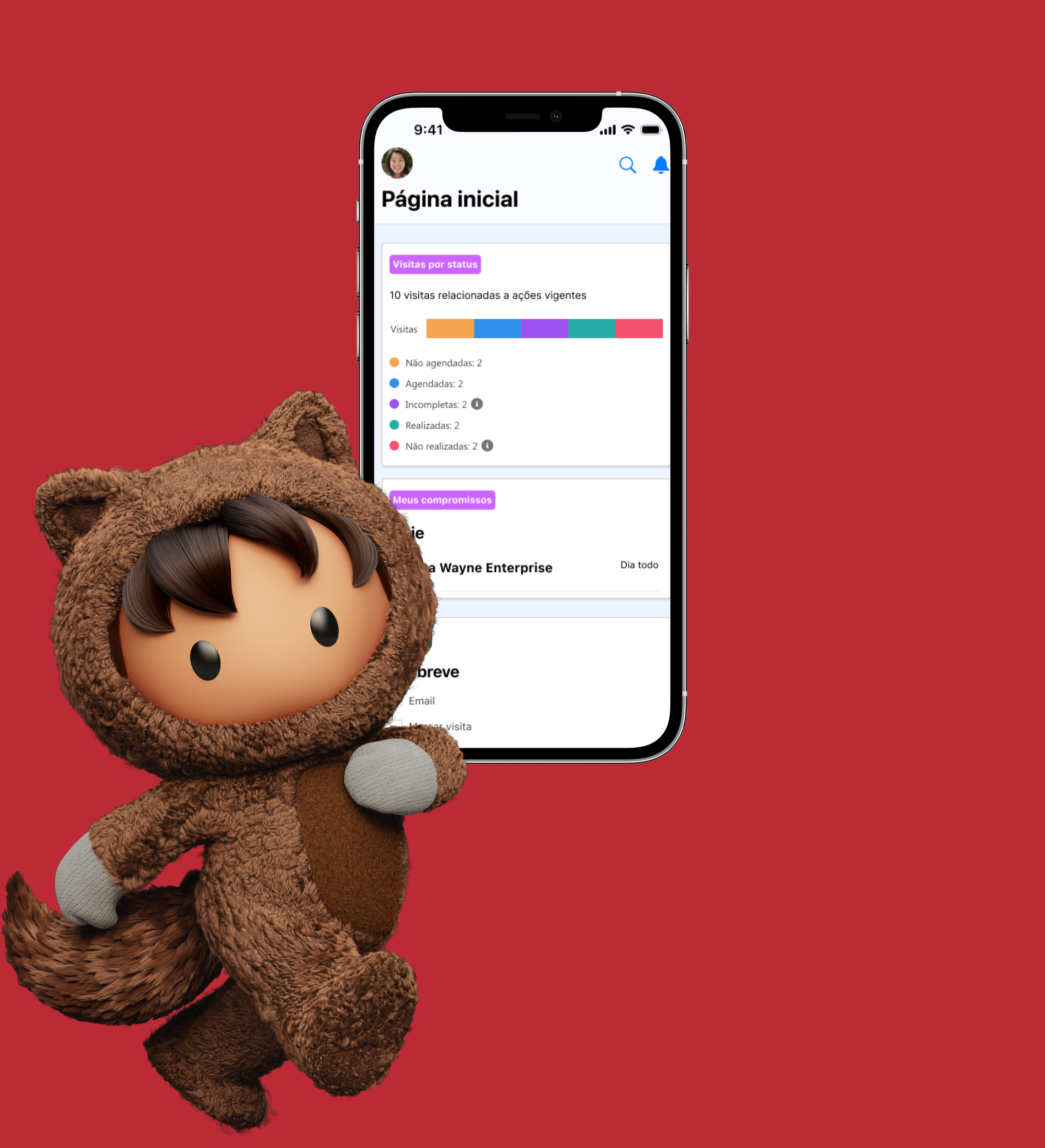
Managers responsible for these corporate clients currently rely on more than 100 disconnected tools and outdated platforms to access client data, perform analyses, and complete tasks.
This fragmentation creates inefficiencies and makes their daily workflows more complex and time-consuming.
Challenge
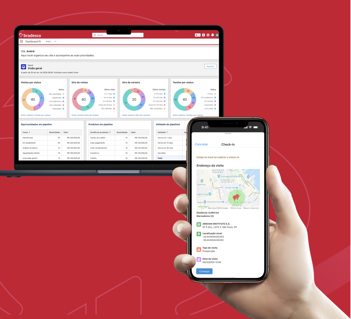
The challenge was to create an all-in-one Business Dashboard that would centralize all tools used by corporate managers and simplify their workflows.
As the UX Writer on the project, my responsibility was to ensure all content was clear, aligned with the brand voice, and focused on usability, enabling managers to work more efficiently.
Strategy
I collaborated closely with stakeholders, developers, and designers to build the dashboard from scratch within Salesforce.
I developed a content strategy that simplified workflows, reduced unnecessary screens, and refined microcopy to lower cognitive load while keeping language clear and consistent with the brand voice.
As a result, managers can now complete tasks 33% faster, with less effort, and overall usability and satisfaction have significantly improved.
Goal
The goal was to design a dashboard that streamlines workflows, centralizes information, and enhances decision-making, allowing managers to spend less time navigating multiple tools and more time on strategic tasks.
UX Proccess
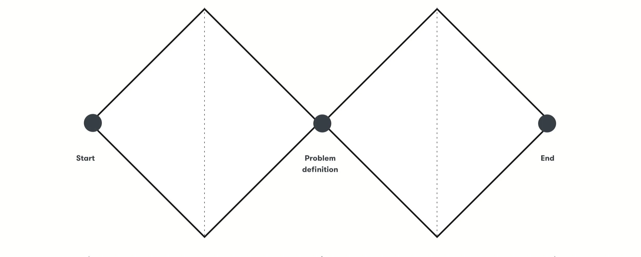
In collaboration with Product Designers, Product Managers, Product Owners, Salesforce developers, and Bradesco stakeholders, we applied the Double Diamond framework to align business goals with real user needs. This included mapping customer journeys, designing flows, and closely coordinating across all disciplines.
Conducted workflow research with managers to identify pain points in their daily activities.
Created personas representing different manager profiles and needs.
Mapped the Salesforce Site Map to understand current system architecture and integration possibilities.
Discovery

Define
“How might we create a unified, intuitive dashboard that enables managers to efficiently access all tools, reduce cognitive load, and make better decisions?”

Ideation
User journey and wireframes
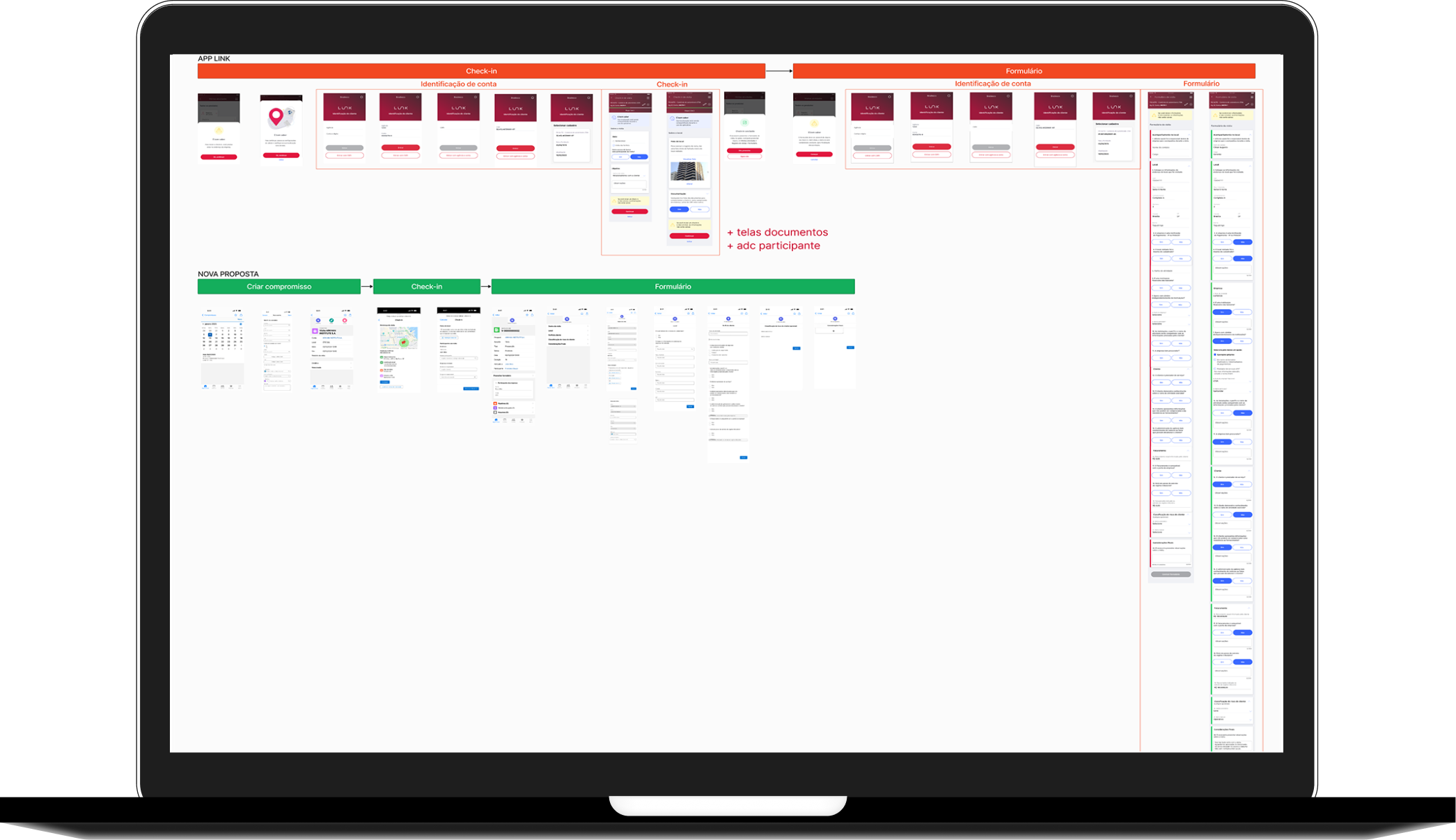
We designed user flows, wireframes, and decision trees, simplifying end-to-end journeys by reducing steps and eliminating unnecessary screens.
Throughout the process, I collaborated closely with Product Designers, Product Owners, Developers, and Stakeholders to ensure both technical feasibility and business alignment.

Content Writing
Writing for Bradesco within Salesforce limitations
One of the key challenges in designing content for the Business Dashboard was working within Salesforce’s technical limitations. While Bradesco already had a Content guide - Liquid, Salesforce’s templates often restricted what could be edited in terms of design, content, and even user journeys. Any customization was costly for the bank, so we had to carefully work within these predefined structures.
To address these limitations, I created a detailed document outlining which aspects of Bradesco’s Liquid content standards could be maintained within Salesforce and where it was not possible to preserve them. For each restriction, I explained the location and reason why the text could not be altered, ensuring that the brand’s voice and clarity were preserved wherever possible.
I then collaborated closely with the Design Ops team, who are responsible for updating and maintaining Liquid, to integrate this guidance into the system. This ensured that future UX Writers working with Salesforce could easily access and apply the same standards, maintaining consistency across the dashboard.
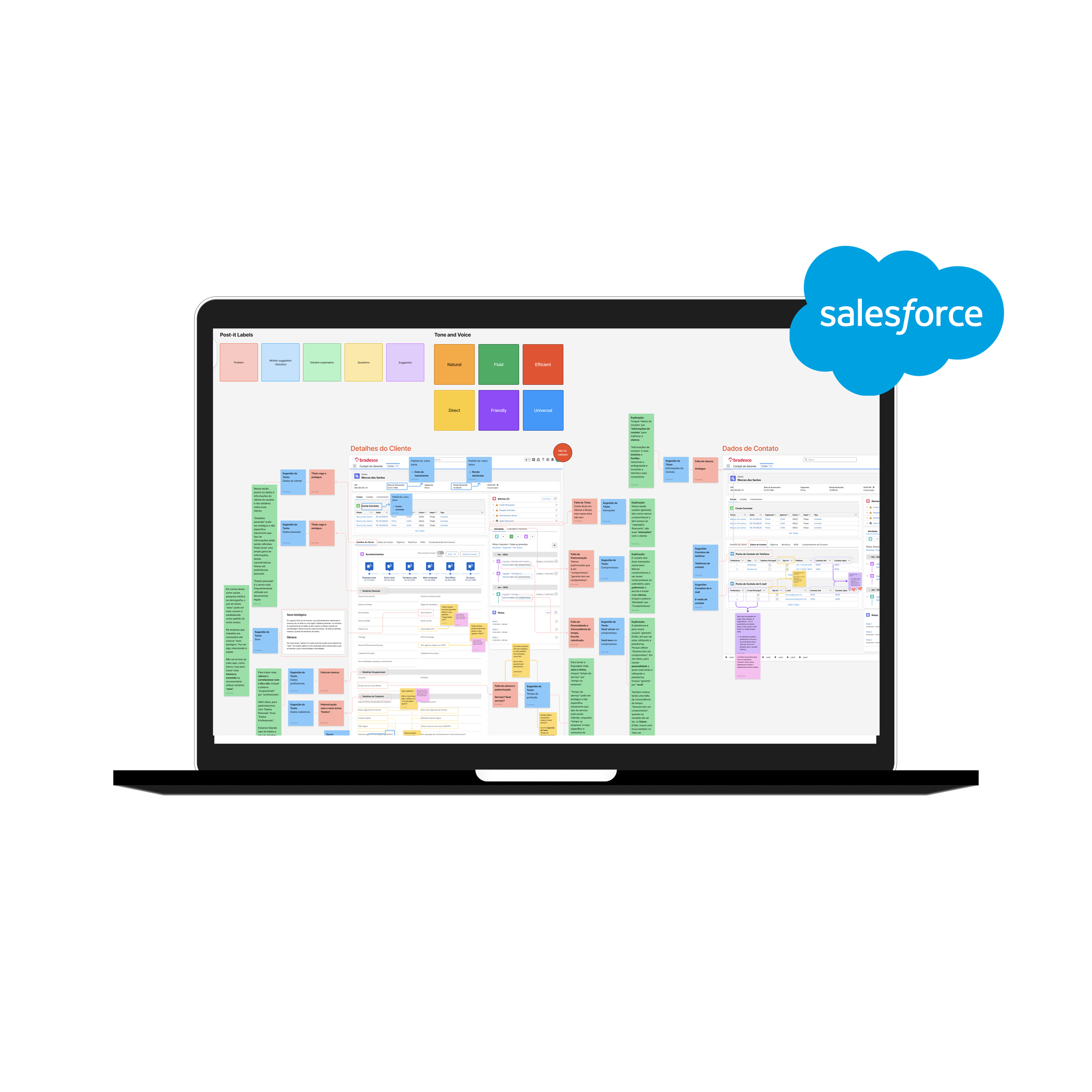
As the first UX Writer on the dashboard for individual client managers, I served as a bridge between individual and business client managers, ensuring both platforms used consistent language and maintained a unified experience. Because Salesforce uses the same “objects” structure for both types of managers, it was essential to align terminology and messaging across all dashboards, preserving Bradesco’s standards and supporting a seamless, user-centered experience.
I also collaborated directly with the research team, conducting interviews with 14 managers to develop a controlled vocabulary that could scale across modules. This vocabulary is continuously updated through additional interviews, helping maintain clarity, consistency, and a user-focused tone throughout all dashboard touchpoints.
Content Writing
Accessibility
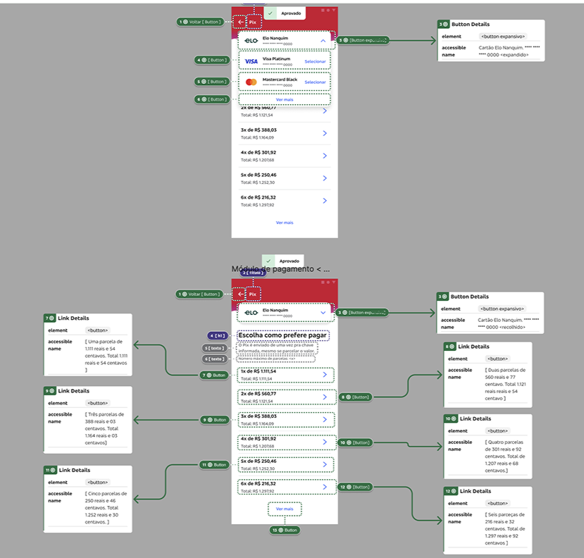
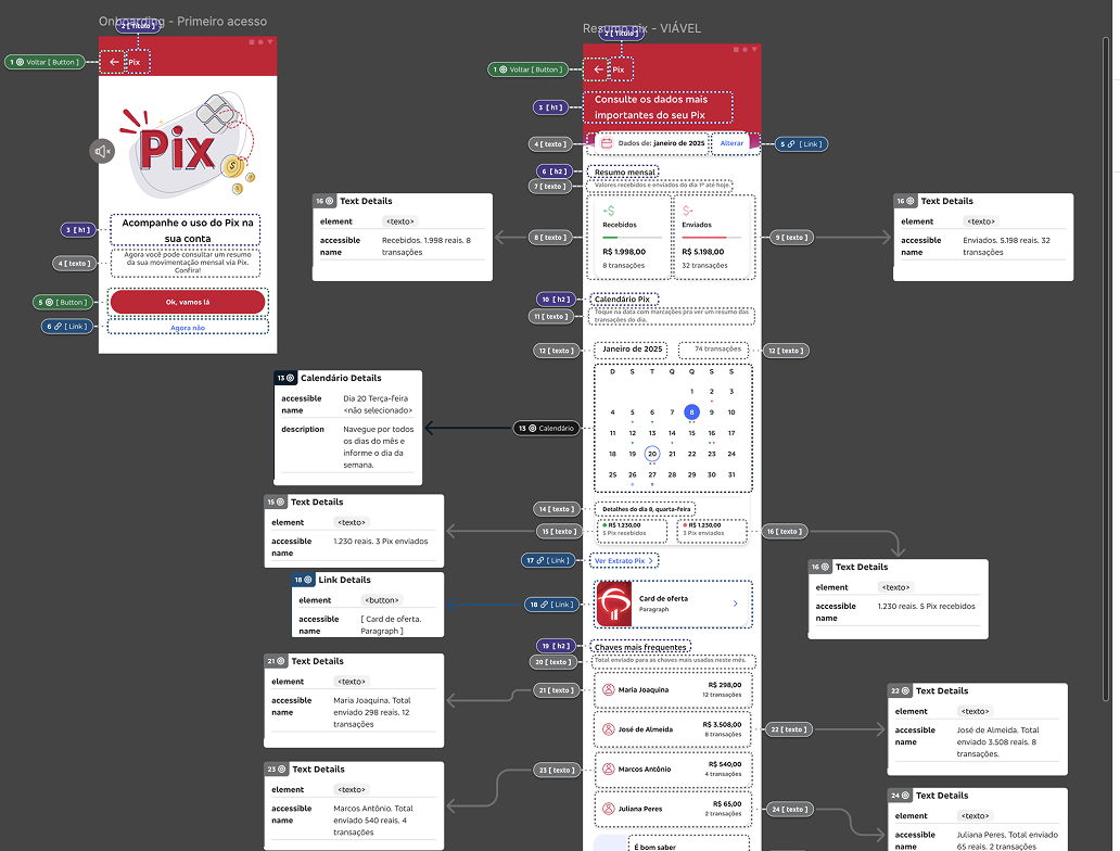
Accessibility was a core pillar in our work. From a content perspective, we focused on creating clear, concise, and scannable text, avoiding jargon and ensuring managers could easily understand key actions.
In partnership with the design team, we followed Bradesco’s accessibility guidelines for color contrast, font size, and text hierarchy, making sure information remained legible across devices and user contexts.
We also adopted inclusive language principles, avoiding biased terms and ensuring consistency for all types of managers and clients. By aligning microcopy, terminology, and visual design, we created experiences that were not only consistent, but also accessible and user-friendly for everyone.
Delivery
Over five months, our team delivered the following journeys:
Visit management
Pipeline
Client profile
Wallet
Campaigns
Open Finance
Retirement
WhatsApp
PIX and TED alerts
Products - Accounts, Cards, Investments, International, Credit, Insurance
Pricing
NPS
Insurance
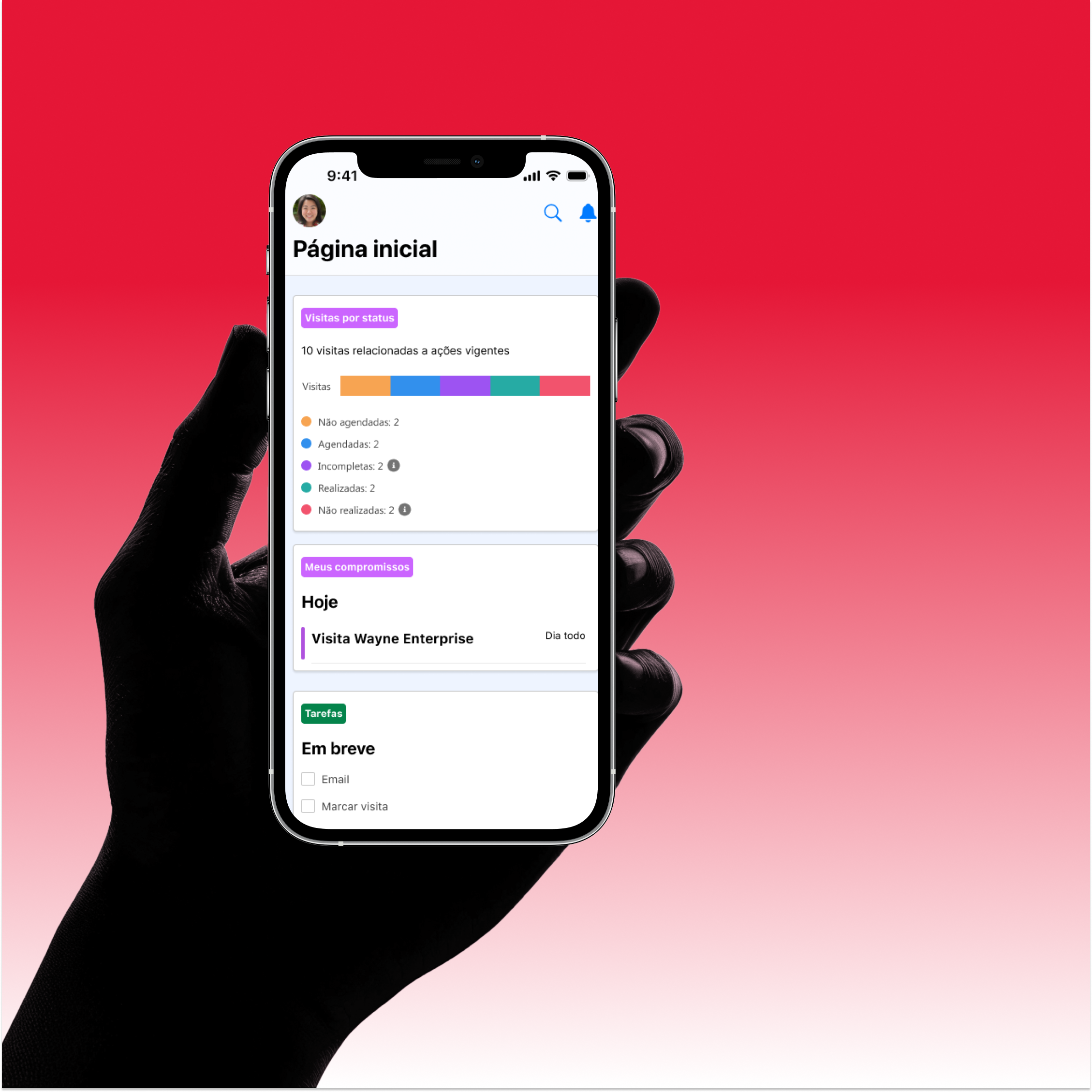
We created over 800 high-fidelity screens and 330 components, ensuring visual consistency and alignment with Bradesco’s content standards, alongside a 200 page manager guide covering workflows, microcopy, and navigation.
Team
Design Team
Flavia Foiato - Content Designer
André Guedes - Product Designer
Brenda Mascarenhas - Product Designer
Customer Journey - Ana Carolina Abreu
Larissa Fiorentin - UX Researcher
Stakeholders
Emerson Maria - Chief Product Owner
Paloma Imperial - Product Owner
Penelopy Holanda - Product Owner
Engineers
Luiz Pimenta - Bradesco Developer
