Bradesco's
BUSINESS JOURNEY

⚠️ Confidentiality notice: To protect Bradesco’s confidentiality, some elements of this case have been adapted. Colors, logos, and research results were modified or anonymized. The examples shown here illustrate my role and contributions, but do not reflect proprietary or sensitive information in their original form.
Project duration
2024 - Today
Problem statement
Bradesco Bank hired me as a Content Designer to help build a unified digital experience for corporate managers using Salesforce. Before this initiative, managers relied on over 100 disconnected tools to manage client relationships, which made their workflows inefficient and fragmented.
The challenge was to design clear, consistent, and accessible content for the new Business Dashboard — a centralized platform that supports managers in prospecting and managing clients with monthly revenues above R$100k. My goal was to align Bradesco’s content standards with Salesforce’s technical limitations, creating an integrated and intuitive experience that simplified managers’ daily routines while preserving the bank’s voice and ensuring cross-dashboard consistency.
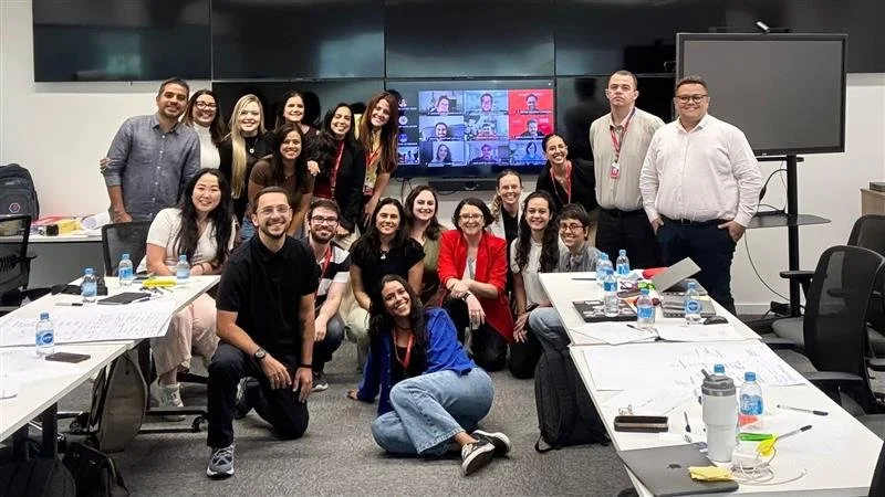
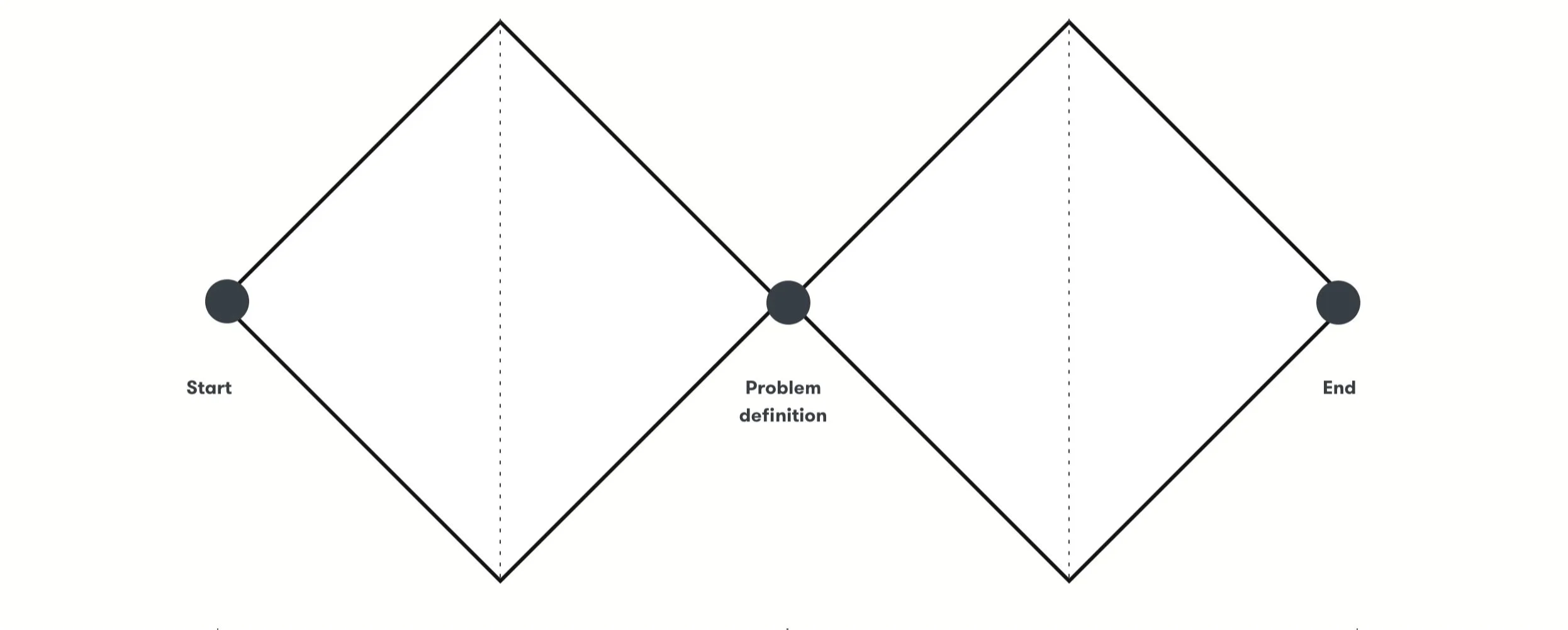
My role and ProcessIn collaboration with a team composed of Product Designers, Product Managers, Product Owners, Salesforce developers, and Bradesco stakeholders, we applied the Double Diamond framework to align business goals with real manager needs.
This included mapping customer journeys, designing flows, and closely coordinating across all disciplines.
Step 1 - Product DiscoveryTo understand managers’ workflows, pain points, and Salesforce parameters, we conducted:
Interviews with 14 managers in collaboration with Bradesco’s research team, mapping workflows and daily needs.
Personas representing different manager profiles — branch manager, assistant manager, and management manager — aligning business objectives with real user journeys.
Salesforce site map exploration to understand system architecture, existing writing and design patterns, and platform parameters.
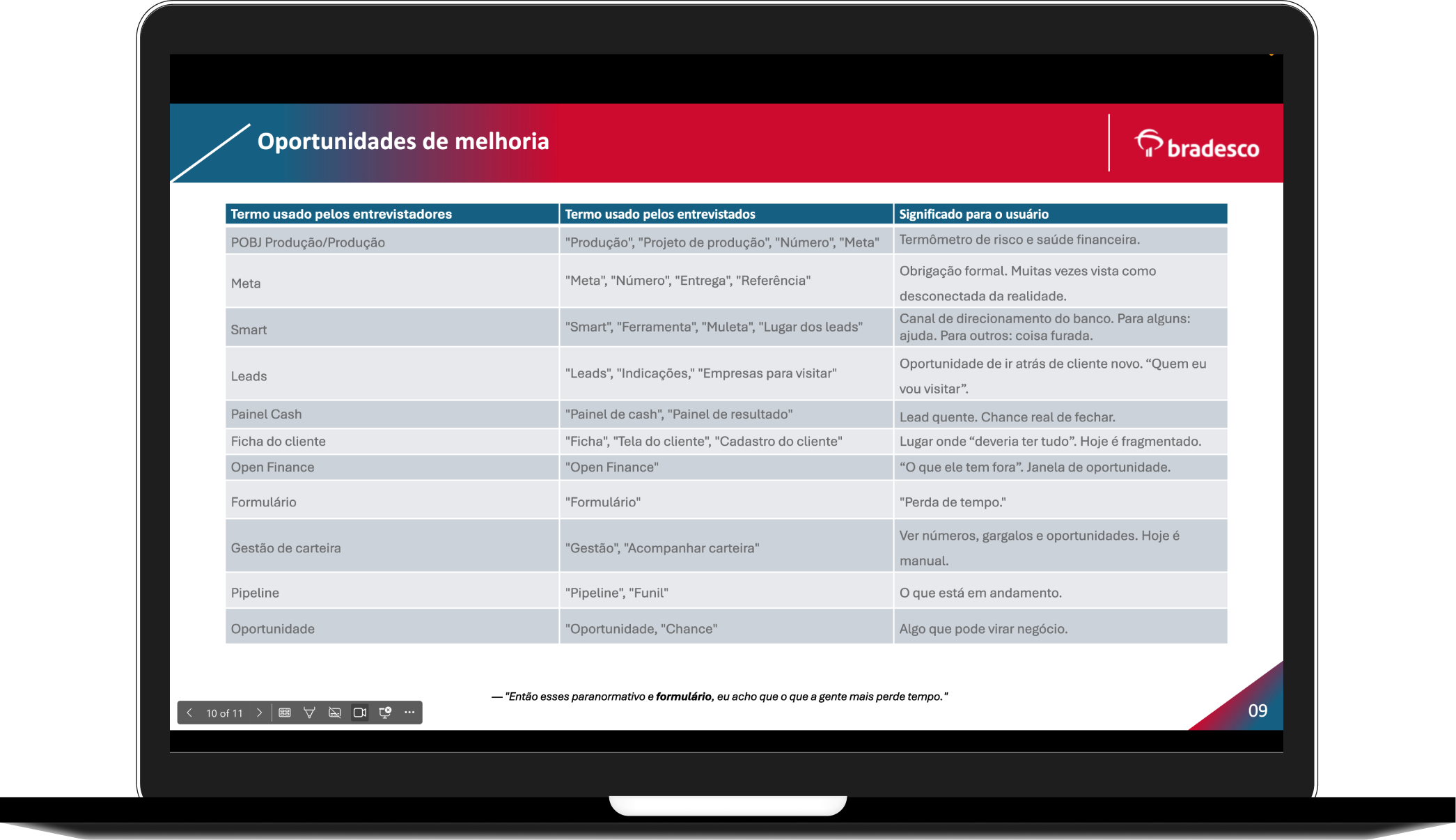
Controlled vocabulary development from interview transcriptions, serving as a foundation for writing and understanding terms and acronyms managers already used, including translations and English terms.
Step 2 - Definition“How might we create a integrated and intuitive dashboard that centralizes all tools, preserves Bradesco’s standards, and respects Salesforce technical constraints while avoiding extra customization costs?”
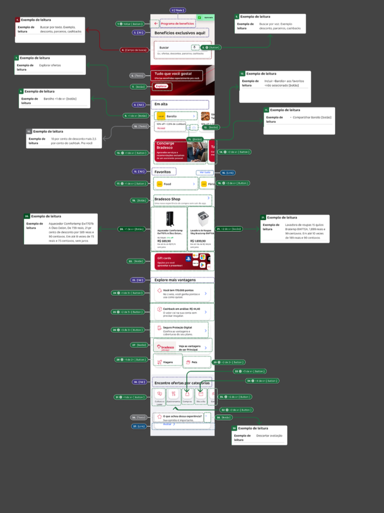
Step 3 - Ideation User journey and wireframes
During ideation, we co-created user flows, wireframes, and decision trees, simplifying end-to-end journeys by reducing steps and eliminating unnecessary screens.
I collaborated closely with Product Designers, Product Owners, Salesforce developers, and stakeholders to ensure technical feasibility and business alignment.

Content Writing: Writing for Bradesco, but following Salesforce standards
A key challenge was working within Salesforce’s technical standards. While Bradesco had the Liquid content guide, Salesforce templates often limited what could be edited in terms of design, content, and user journeys. Any customization was costly, so we had to adapt writing while preserving the bank’s voice.
I created a detailed guide outlining which Liquid standards could be maintained and where adjustments were necessary, specifying the location and reason for each restriction. I collaborated with Design Ops to integrate this guidance, ensuring future UX Writers could apply the same standards and maintain consistency across all dashboards.
As the first UX Writer for the Dashboard managers, I also acted as a bridge between individual and corporate dashboards, ensuring consistent language and a seamless user experience. Since Salesforce uses the same “objects” structure for both, aligning terminology and messaging across dashboards was essential.
Additionally, we developed a controlled vocabulary, continuously updated through follow-up interviews, to maintain clarity, consistency, and a user-focused tone across all dashboard modules.

Content Writing: Accessibility
Accessibility was a core pillar of our work. From a content perspective, we prioritized clear, concise, and scannable text, avoiding jargon and enabling managers to quickly understand key actions.
In partnership with the design team, we applied Bradesco’s accessibility guidelines for color contrast, visual hierarchy, and font sizes, ensuring legibility across devices and usage contexts. We also adopted inclusive language principles, avoiding biased terms and maintaining consistency for all manager and client profiles.
By aligning microcopy, terminology, and visual design, we created experiences that were not only consistent but also accessible and user-centered.
Content Writing: Metrics-informed ideation
Metrics were incorporated early in the ideation phase to guide content decisions and reduce rework within Salesforce’s technical constraints.
Based on previous data and early validations, we defined clear benchmarks for content efficiency and clarity, using metrics such as ETR (Estimated Time to Read), CTR on key actions, Open Rate of operational communications, and flow analysis as decision criteria rather than post-launch evaluation only.
During ideation, these metrics informed:
content length and information density per screen
prioritization of primary vs. secondary actions
wording and hierarchy of CTAs
distribution of instructions across the journey
This approach ensured that content proposals were feasible within Salesforce templates, aligned with Bradesco’s tone of voice, and optimized for real field usage from the start.
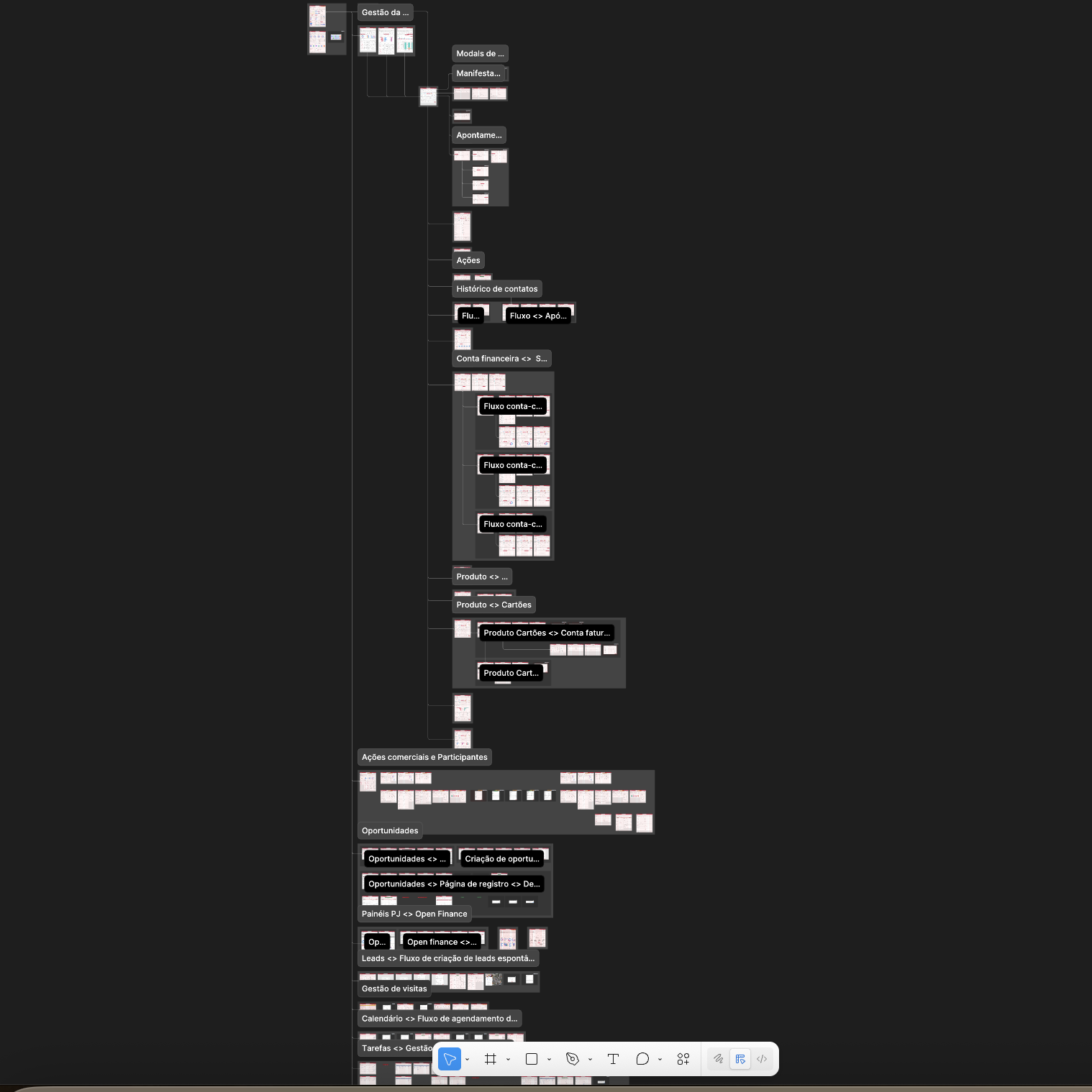
Step 4 - DeliverySince October 2024, the team has delivered multiple dashboard journeys in iterative sprints, each producing high-fidelity screens and integrated UX Writing content. Key deliveries include: Portfolio overview, Client profile, Actions and opportunities, Mobile and desktop visit management.
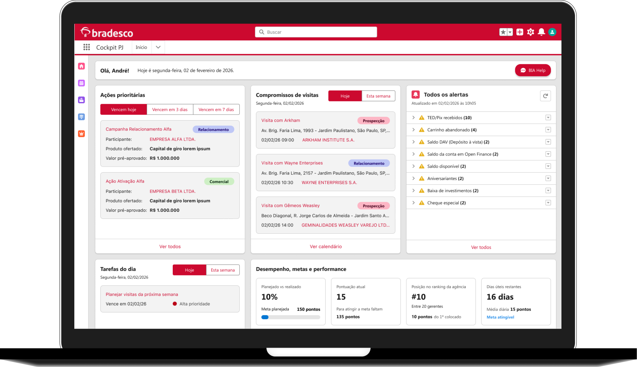
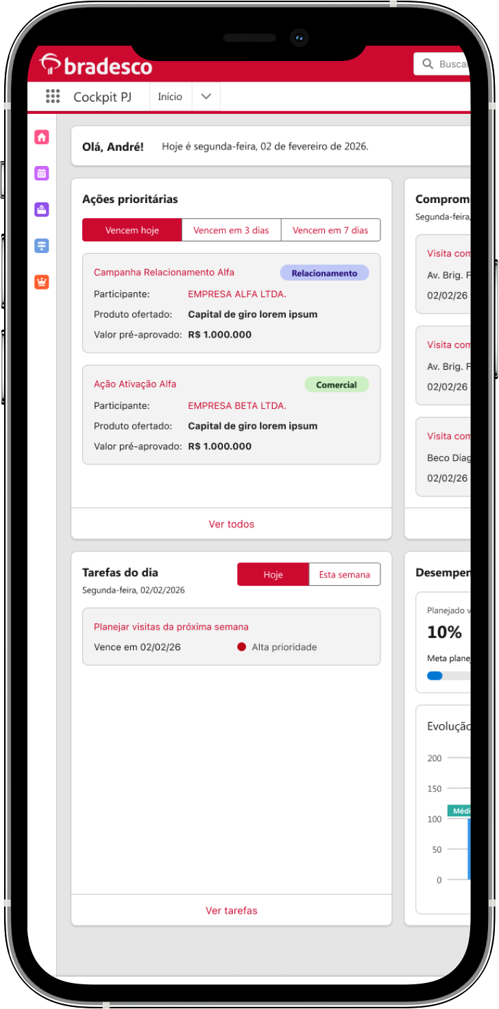
The Portfolio overview was designed as the manager’s starting point, the place where they organize their day and track priorities. It centralizes key information such as:
Client visits and follow-ups
Daily tasks and pending activities
Sales performance and new opportunities
Calendar view for scheduling and planning
This dashboard goes beyond summarizing daily activities: it serves as the gateway to the whole experience. It was chosen as the first delivery because managers access all other dashboards and screens from here.
Portfolio overview
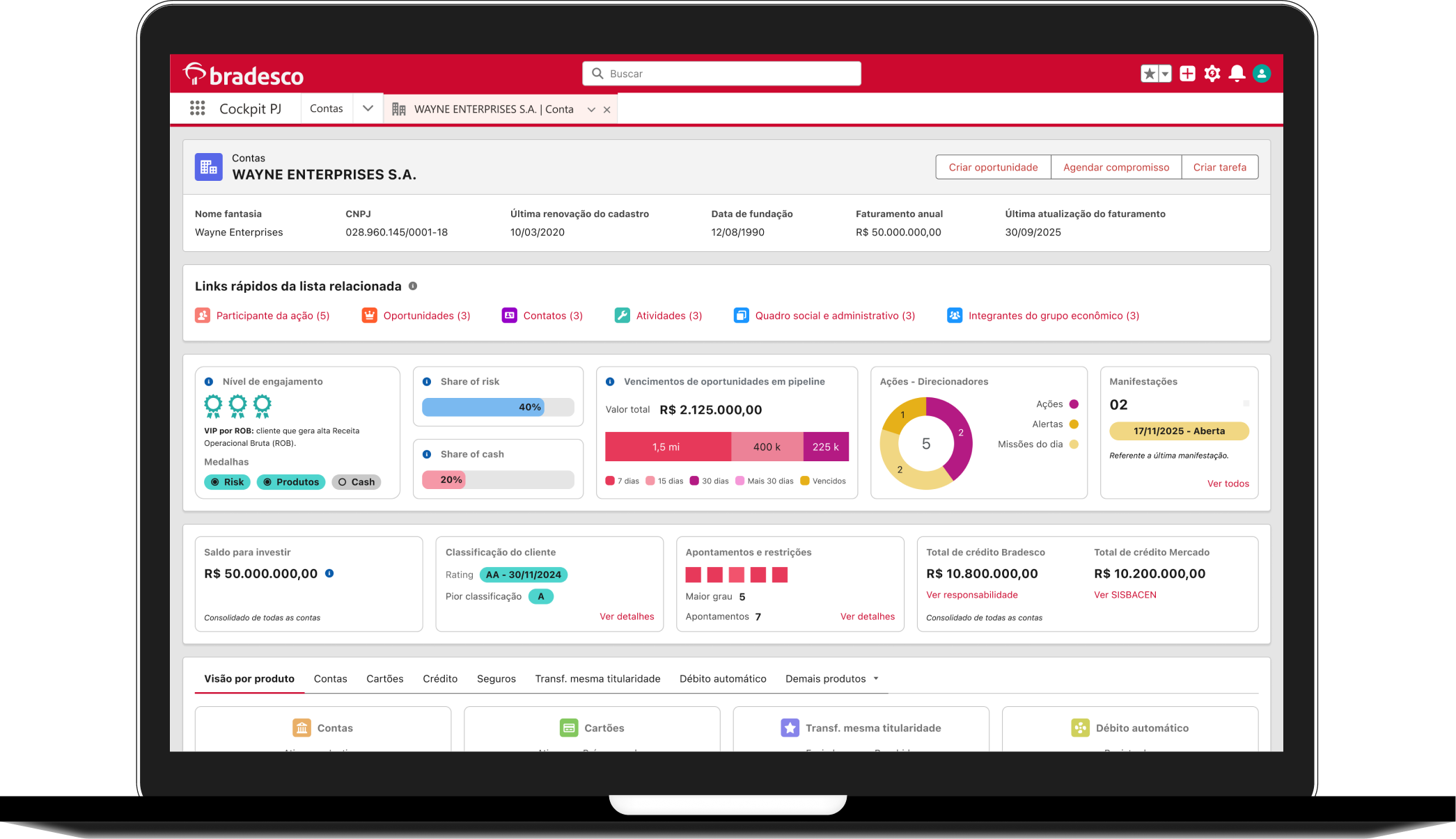
Client profile
The Client profile centralizes all personal and business information about each client. It gives managers a complete view, including:
Account details and financial products
Cards, documents, and registered addresses
Assigned managers and contact history
Key personal information relevant to daily interactions
This screen ensures managers have everything they need in one place to understand their clients and strengthen relationships.
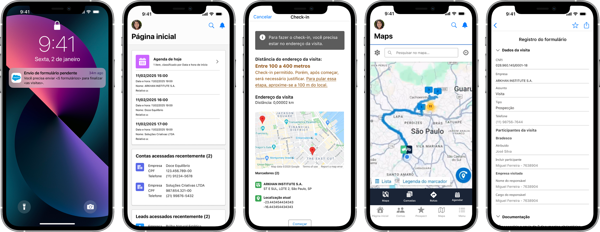
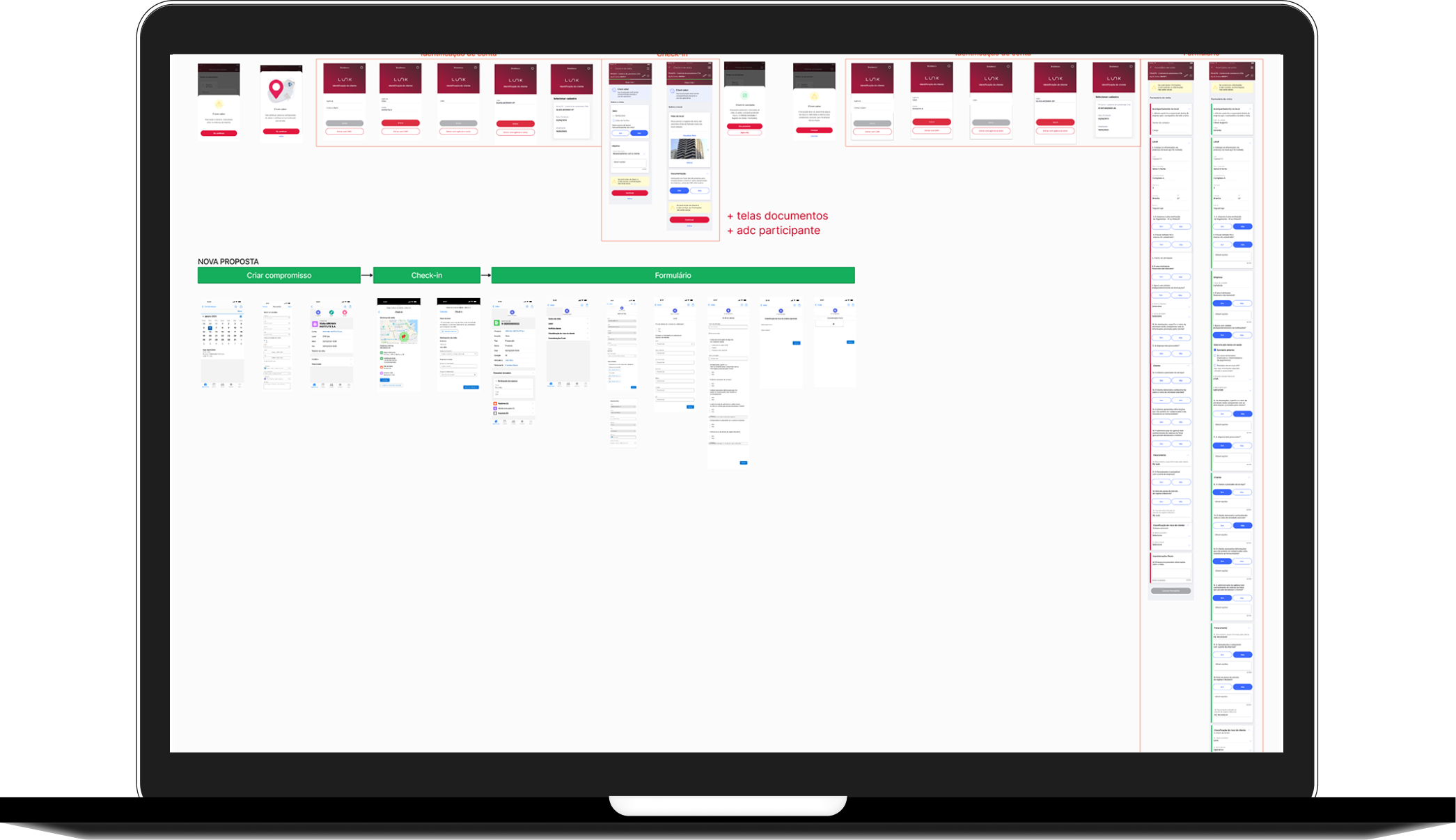
Visit journey
The visit journey supports managers in planning, executing, and reporting client visits. Key features include:
Check-in at the client site: Managers must be physically present to record the visit and take a photo of the company’s facade, preventing inaccurate reporting.
Visit reports: Streamlined reports with concise, direct questions, reducing the number of screens by 33% and making it faster to complete.
Compliance & accountability: Ensures that visits are actually conducted, addressing a prior business issue where managers sometimes submitted photos taken online instead of visiting clients.
By optimizing the text and structure of visit reports, this dashboard increases efficiency, accuracy, and accountability in the daily routines of managers.
Metrics & Impact
33% reduction in the number of steps/screens in the visit report flow.
33% faster task completion time for filling out visit reports.
87% completion rate for the visit reporting journey, indicating lower friction and higher adoption.
ETR analysis supported content simplification across the journey, reducing the estimated reading time per screen from 12–15 seconds to 5–8 seconds, aligned with real field usage conditions.
We sent a notification to managers reminding them of pending visit reports. Out of 250 recipients, 208 opened the message, resulting in an 83% Open Rate.
Low CTR on top-positioned buttons led to microcopy improvements and A/B testing. Clearer, task-oriented labels improved action discoverability and alignment with users’ goals during check-in.
Continuous deliveryThe Portfolio Overview, Client Profile, Opportunities & Campaigns, and Visit Management were just the beginning. We continue to expand this dashboard with new journeys and features, such as: Open Finance, Pricing, WhatsApp Alerts, PIX and TED, Products (Accounts, Cards, Investments, International, Credit, Insurance), NPS, Insurance, Retirement.
This ongoing evolution ensures the dashboard remains a central, living tool that grows with managers’ needs and supports Bradesco’s long-term digital strategy.
Team
Design
Flavia Foiato - Content Designer
André Guedes - Product Designer
Brenda Mascarenhas - Product Designer
Customer Journey - Ana Carolina Abreu
Larissa Fiorentin - UX Researcher
Leonardo Bastos - UX Researcher
Stakeholders
Emerson Maria - CRM Manager
Paloma Imperial - Product Owner
Penelopy Holanda - Product Owner
Engineers
Luiz Pimenta - Salesforce Developer